Chapter 6: Benefits of Geological Mapping: Quantitative Assessment of Responses to Stakeholder Questionnaire
Abstract
Of those respondents who provided full information, 62.7% worked in the private sector and 37.1% in the public sector. In the public sector, 57.7% of respondents represented state and local governments, and 20.8% were from educational institutions. Independent geologists formed the largest single responding group in the private sector. About 26.7% of respondents worked in organizations employing up to five persons, 23.8% in organizations with 6 to 50 employees, 13.1% with 51 to 200 employees, and 36.4% worked in larger organizations. The analysis indicates that the size of the respondents’ employer had no influence on their benefit assessment.
About 37% of respondents indicated a preference for digital or online access to geological maps. GIS format maps are the most desirable digital product. Derivative maps addressing water resources were of high interest to 25.8% of respondents. Surface topography maps also received a substantial number of responses. As in previous studies, higher resolution maps at scales of 1:24,000 or larger were overwhelmingly preferred by 72% of respondents. 3D maps were not yet available extensively. However, they are likely to receive increased uses in the future.
Input about the monetary assessment of map values and benefits was solicited in various ways, such as time and costs saved in the past five years (median time saved 20%, median cost saved 15%), project specific value per map used (median value $11,162 to $18,375), willingness to pay for a geological map (median of $3,000), long-term value of a map (median value $10,000), and expected high, low, and likely payment for a map (median expected payment $2,883). Respondent’s willingness to pay did not seem to depend on the size of their organization.
6.1: Introduction
As previously explained, a questionnaire was distributed to over 81,000 individuals identified as stakeholders in the use of geological maps because of their affiliation (directly or indirectly) with the geosciences and the likelihood that their professional activity requires and benefits from the use of geological maps and information. A total of 4,779 individuals submitted responses. As seen from the questions in Appendix 2, the objective was to obtain in the words of the stakeholders (1) how the use of geological maps and information benefit them professionally; (2) what significance they see in maps prepared by scientists employed at publicly funded institutions; and (3) how they would quantify those benefits. For the quantification of benefits, the respondents were asked to assess in terms of time and money saved, because maps were readily available to them at little or no cost, and to estimate how much they would pay for a geological map if maps made by state and federal agencies were not available.
A non-controllable outcome of having questionnaires forwarded by societies and associations to their members was that 140 were sent to SGS employees and about 40 to individuals working solely in foreign countries. Questionnaire responses from SGS staff were excluded to avoid conflicts of interest. Responses from individuals working solely in foreign countries were also excluded, because this assessment covers only the U.S. For the latter, some foreign respondents did conduct work in the U.S. and were therefore included. In addition, those USGS employees who responded were not excluded. The USGS is a 9,000-person agency with different scientists within several mission areas (e.g., water, hazards, ecosystems, minerals, etc.) in numerous locations throughout the U.S., all of which are direct beneficiaries of geological maps produced by their own USGS Core Sciences Mission Area, as well as SGS. However, SGS have relatively small staff sizes with overlapping duties for both producing maps and developing derivatives. Therefore, it would be a conflict of interest for SGS staff to assign a value on something that they created.
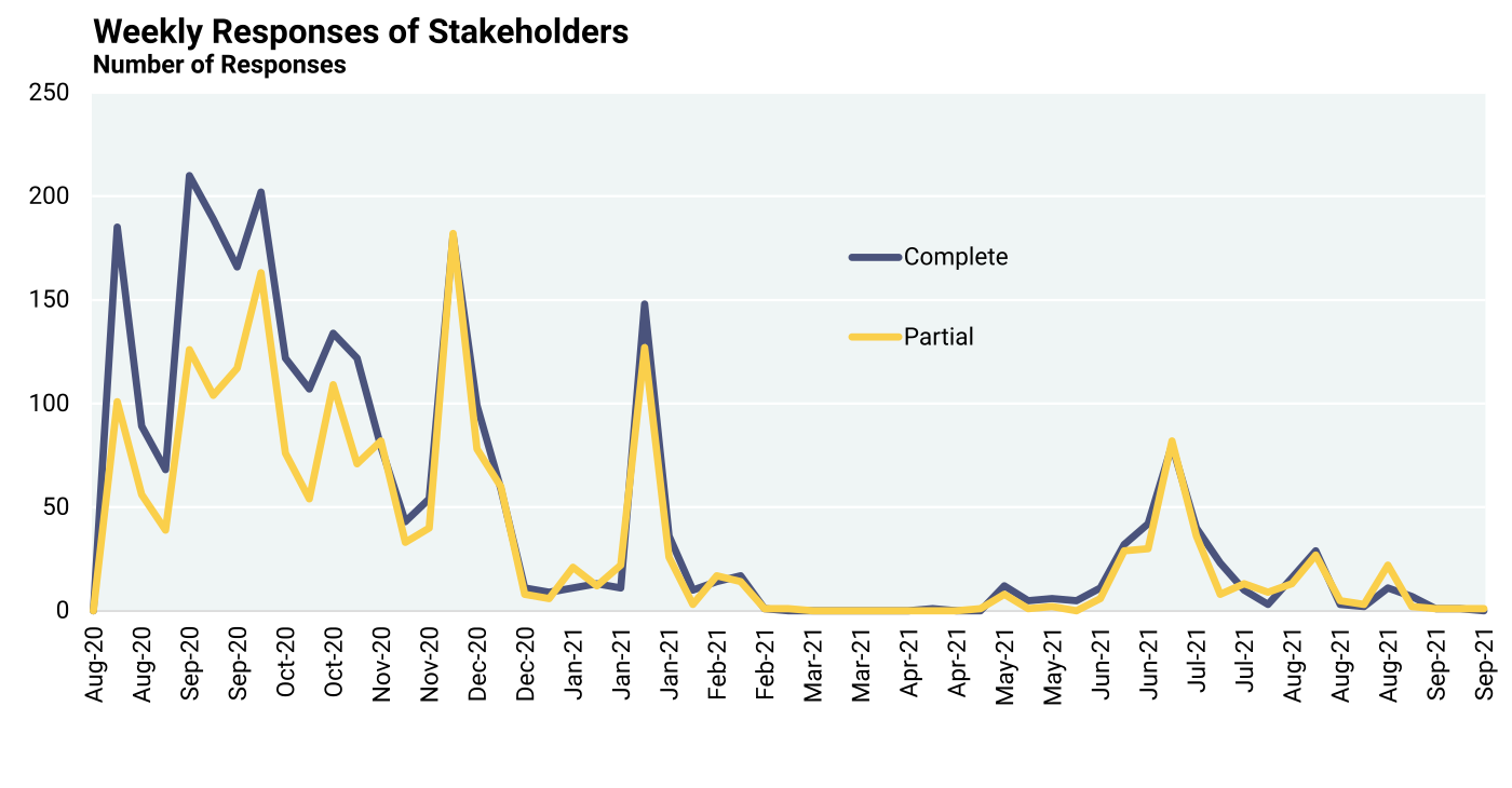
This chapter first describes the characteristics of the sample of stakeholders who responded followed by the evaluation of stakeholder responses in the sequence in which the questions were asked. Most responses from stakeholders were received in the first four months from August 10, 2020, through December 14, 2020. Some additional responses were received through September 2021. A reminder to responders who had submitted incomplete questionnaires resulted in a small number of additional responses, although the proportion of complete and incomplete responses did not change appreciably (Figure 6.1.1).
6.2: Stakeholder Background
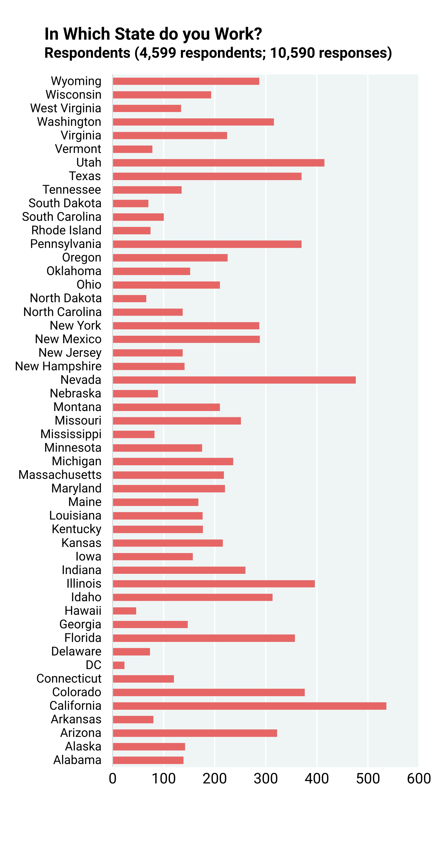
Stakeholders responding to the survey were active in all parts of the U.S. Figure 6.2.1 is a compilation showing in which state the respondents work. As mentioned above, respondents working at SGS were excluded, and this was consistent with their exclusion from all monetary and other evaluations of maps to avoid conflicts of interest. Respondents working in foreign countries were also not included in this figure. The frequency with which states were mentioned are presented. Also, many respondents worked in more than one state, and some in foreign countries also worked in one or more states. The total number of responses (over 10,000) therefore exceeds the number of respondents. All states, including the District of Columbia, are well represented.
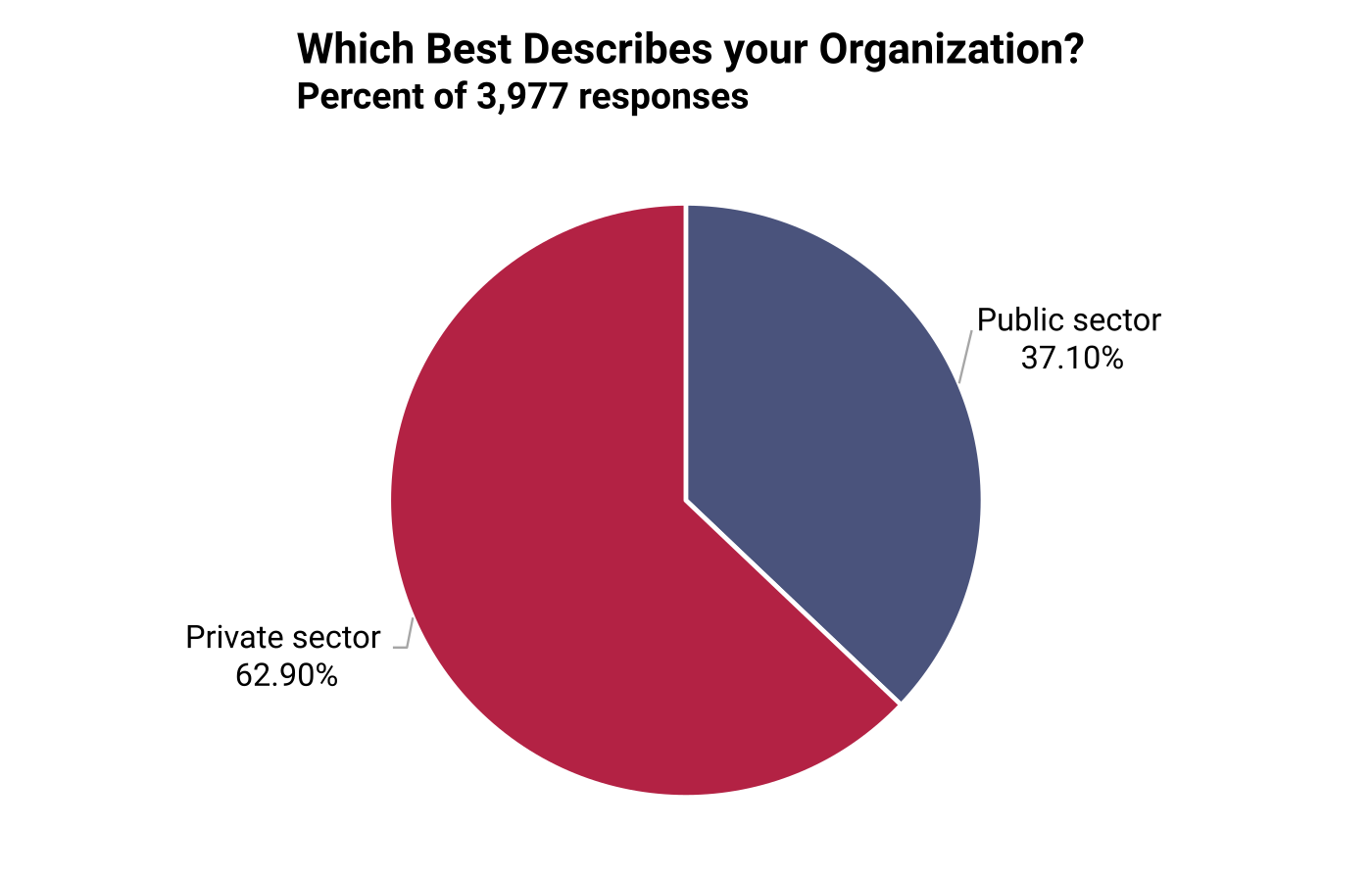
The respondents worked in both the private and public sectors (question 1). About 62.9% worked in the private sector and 37.1% in the public sector (Figure 6.2.2).
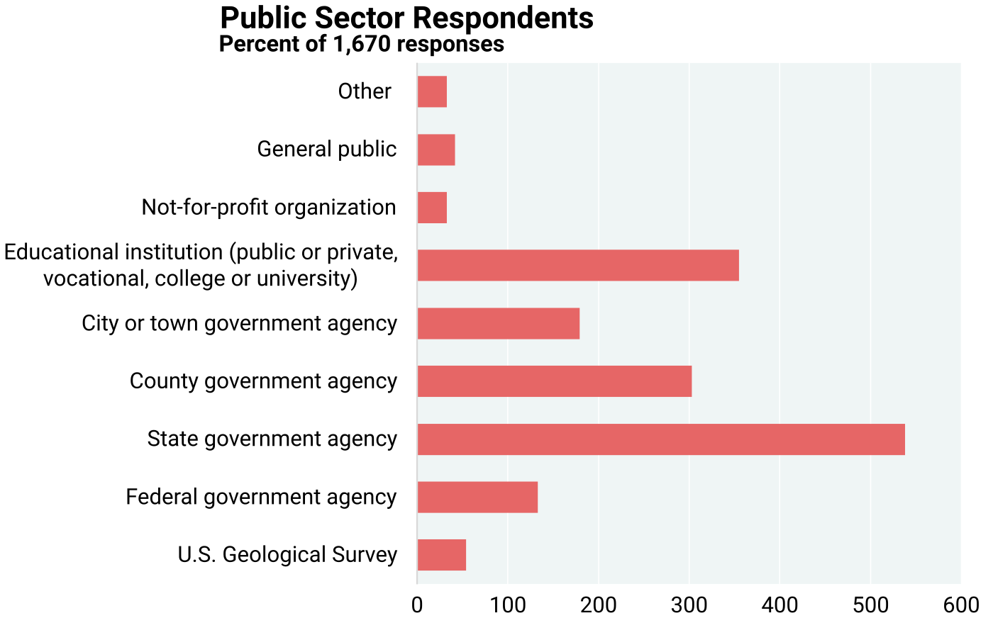
Figures 6.2.3 and 6.2.4 indicate the broad representation of a wide segment of public and private sectors (questions 1A and B). Some of these apparently work in private as well as public sectors. State and local government entities account for 57.7% and educational institutions for 20.8% of public sector responses. In the private sector, 2,527 responders provided 5,171 responses averaging about two responses per person, indicating the overlap of activities among categories (Figure 6.2.4). Large and small mineral and energy industries account for 25.7% of responses. The largest single group of responses in the private sector are from independent geologists (17%), whose actual areas of work are unknown. The same person may be active in more than one private sector category. For example, mining and water management may be complementary geological activities, or geotechnical investigations may be involved in construction, transportation, or real estate.
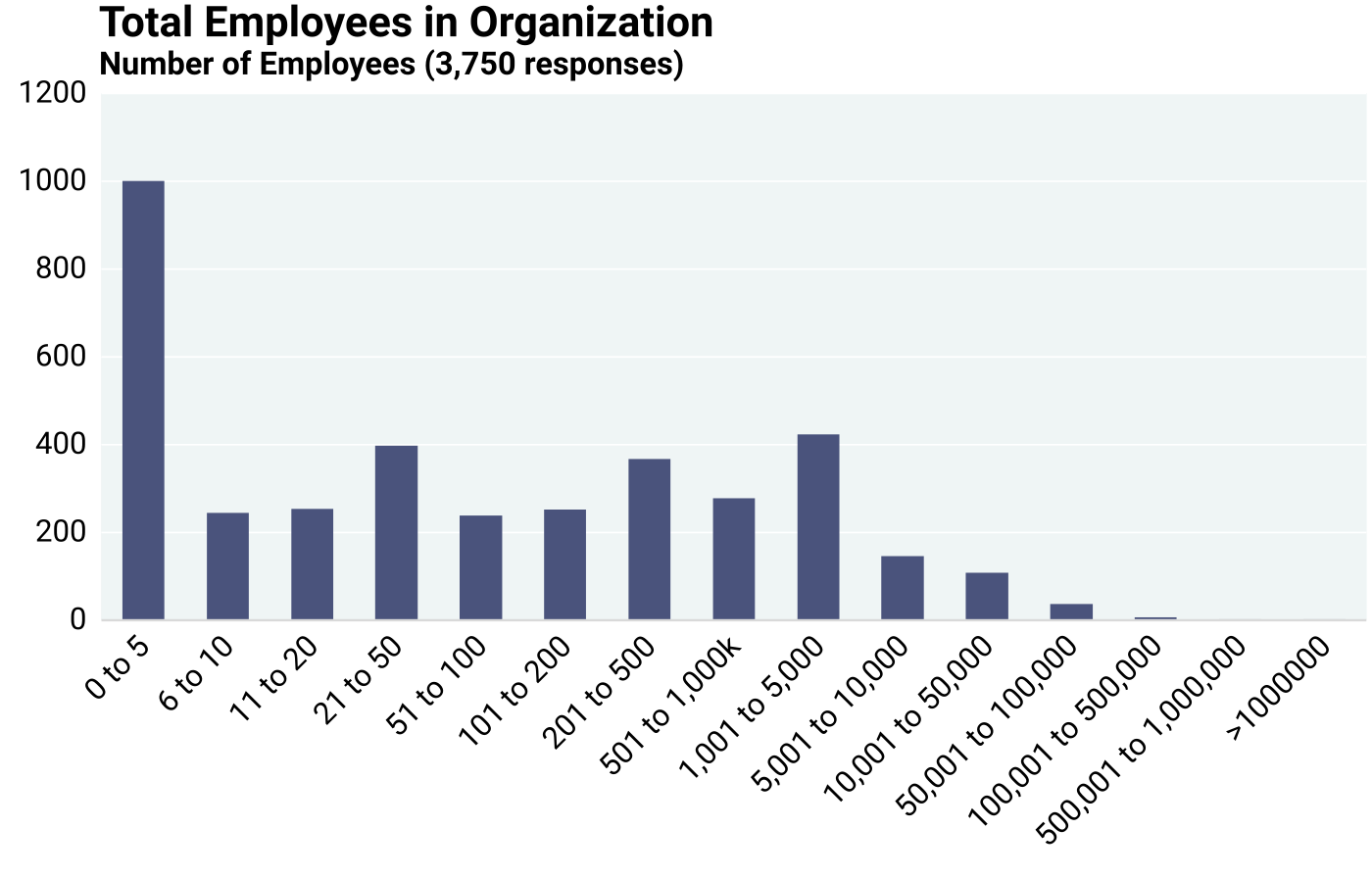
Responders came from all sizes of organizations in terms of employment (question 1C). Employment information was provided by 3,749 respondents. The median number of employees in organizations was 180, whereas the mean number of employees was 2,955. Without the 44 very large organizations that were reported, the mean declines to 2,241. The data show that small and medium-sized organizations are well represented. About 26.7% of respondents work in organizations with up to 5 employees (respondents who stated zero persons employed in their organization are evidently working on their own). About 23.8% of the respondents work in organizations with 6 to 50 employees, and 13.1% with organizations of 51 to 200 employees. The remaining 36.4% of the respondents work with organizations larger than 200 employees (Figure 6.2.5). Sampling this diversity of applications by a variety of users at different levels with different budgets for various projects was an explicit intent of this economic analysis of geological mapping, such that it would be as inclusive as possible and representative of a broad spectrum of economic and user-driven needs. However, the following analysis in this chapter indicates that the assessment of map value is not influenced by the size of the organization using geological maps.
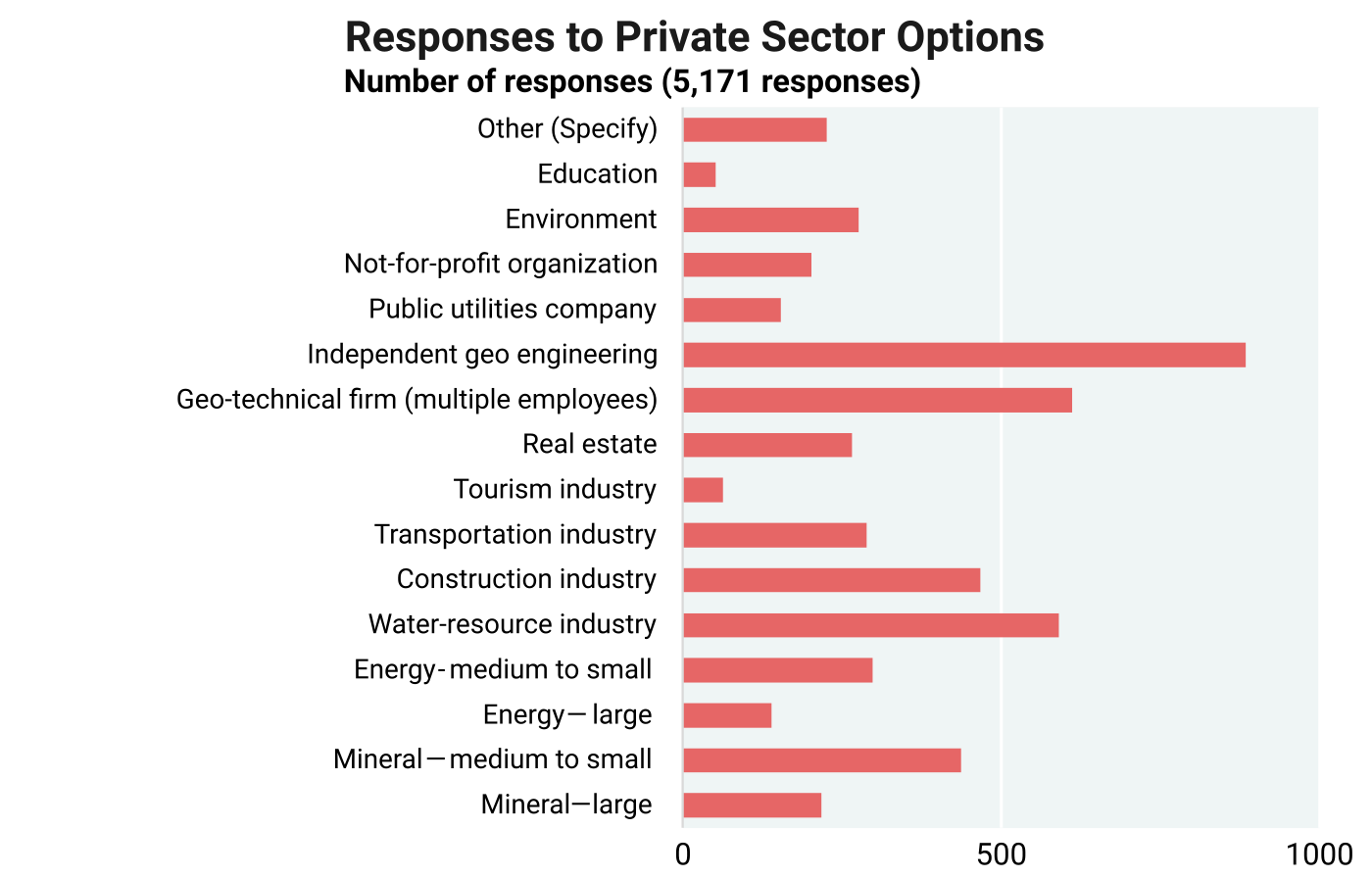
A more detailed assessment of industry responders is depicted in Figures 6.2.6 through 6.2.14 (question 2). In all the graphs, the number of responses is considerably larger than the number of individuals who responded because many are active in multiple areas of application. The data in the graphs indicate the breadth of the U.S. economy for which geological maps are fundamentally important. Regional aggregation of data provides no additional insights into any relationship between number of responses and value assessment. For simplicity, some of the most frequently mentioned areas of application include the following: groundwater and surface water, industrial minerals, pollution prevention, pollution, remediation, flood hazard, soil quality, roads, highways and bridges, dams, retaining ponds, zoning decisions, landscape design and planning, state and federal land-use planning, utility corridors, hazard identification, land acquisitions, basic research, applied research, field trips, and outdoor recreation.
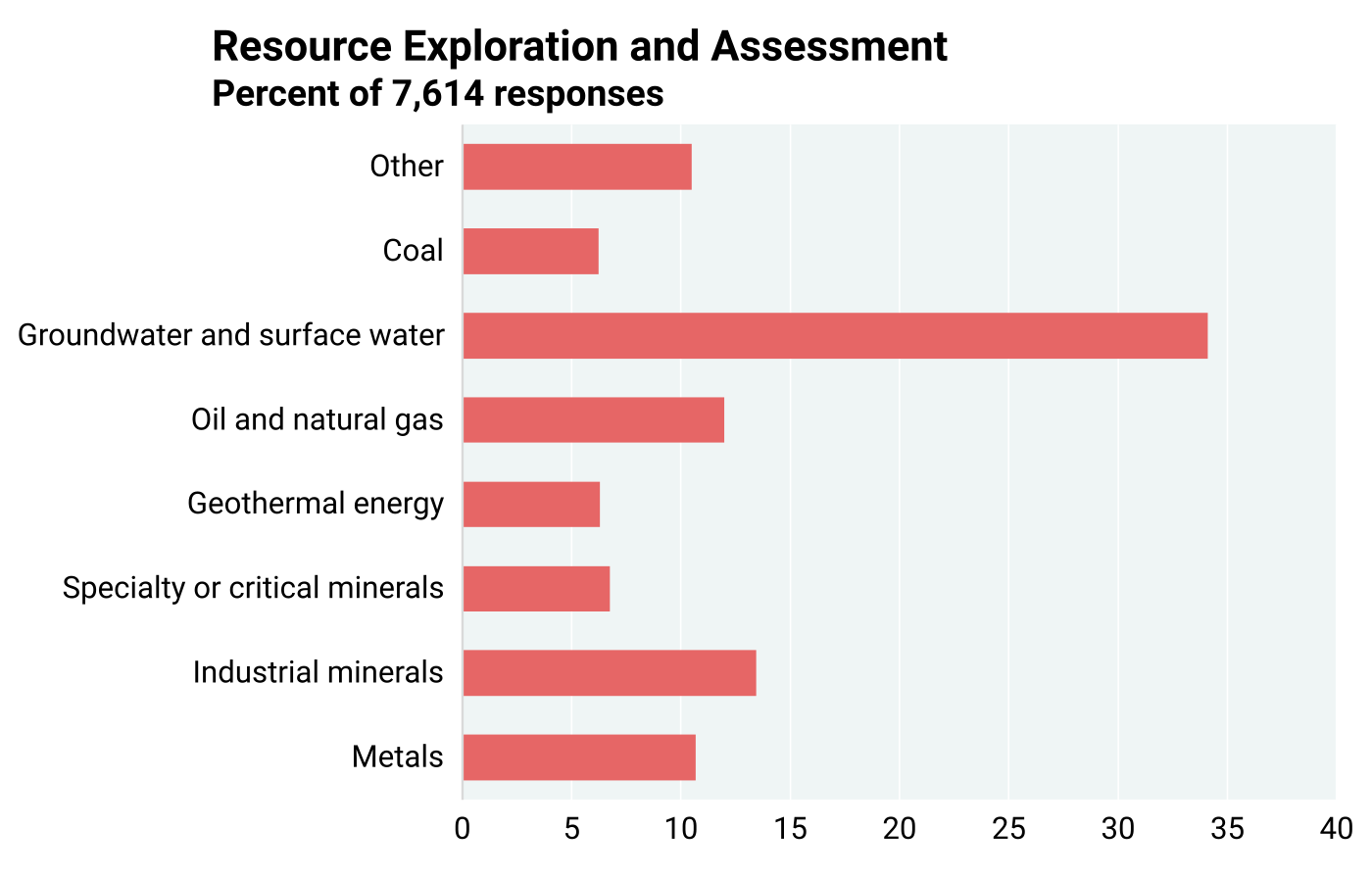
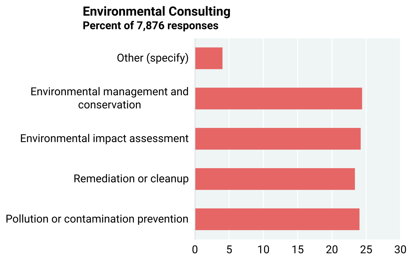
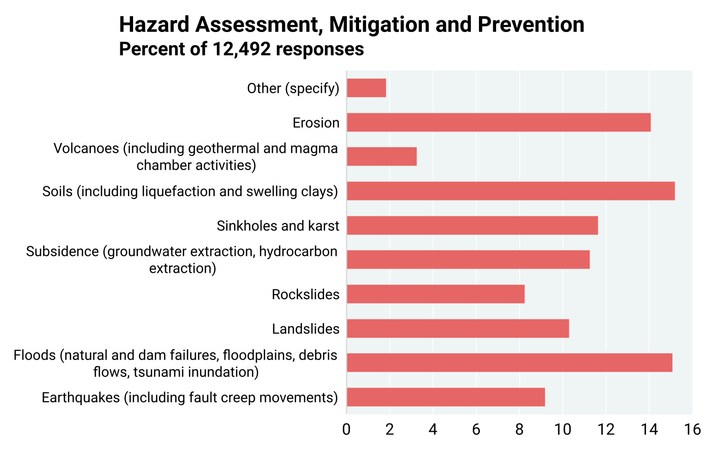
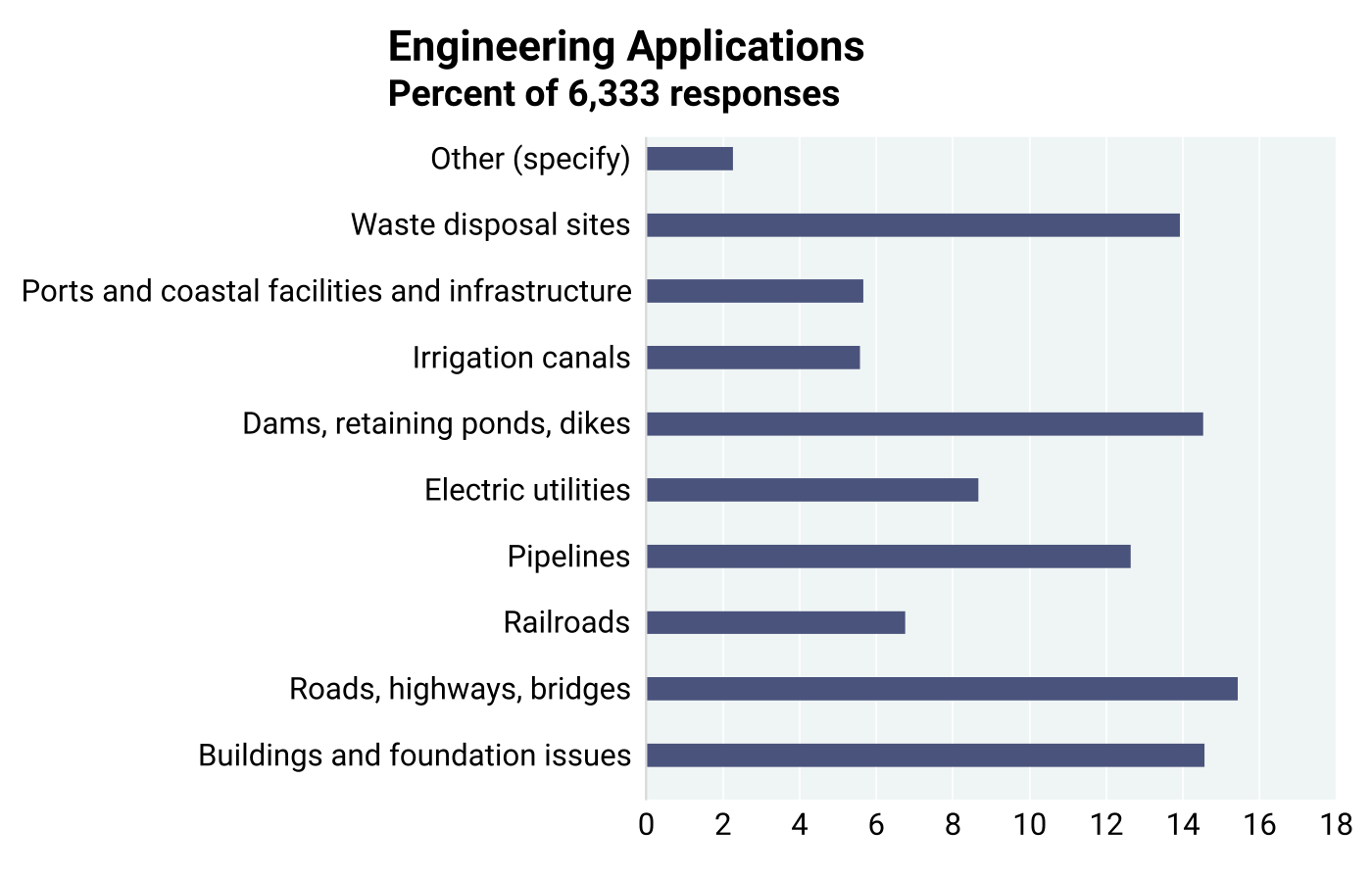
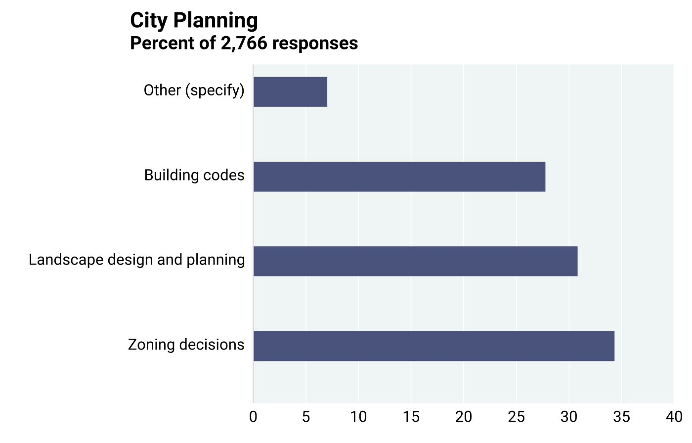
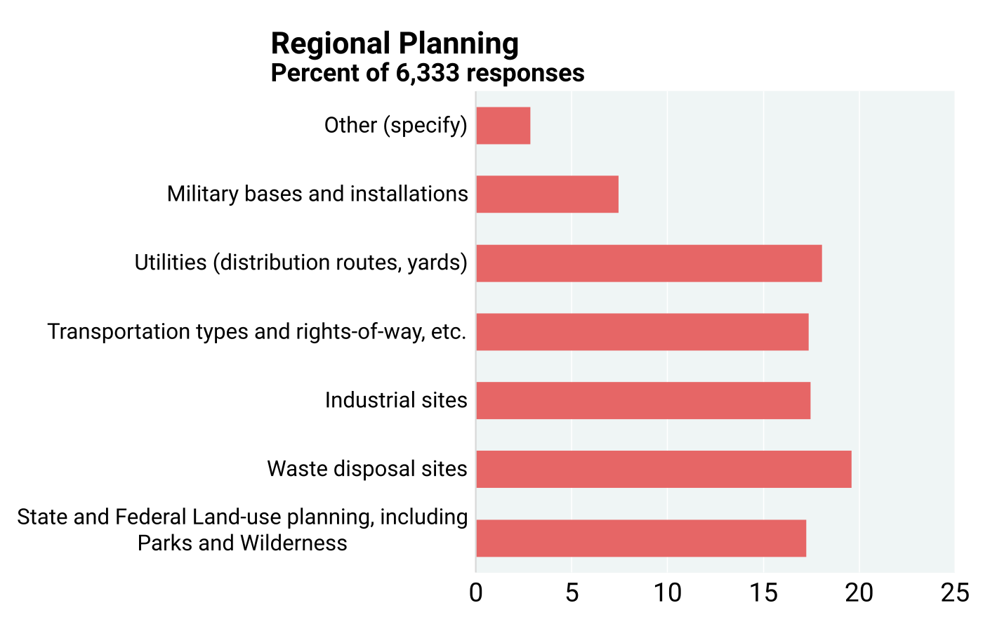
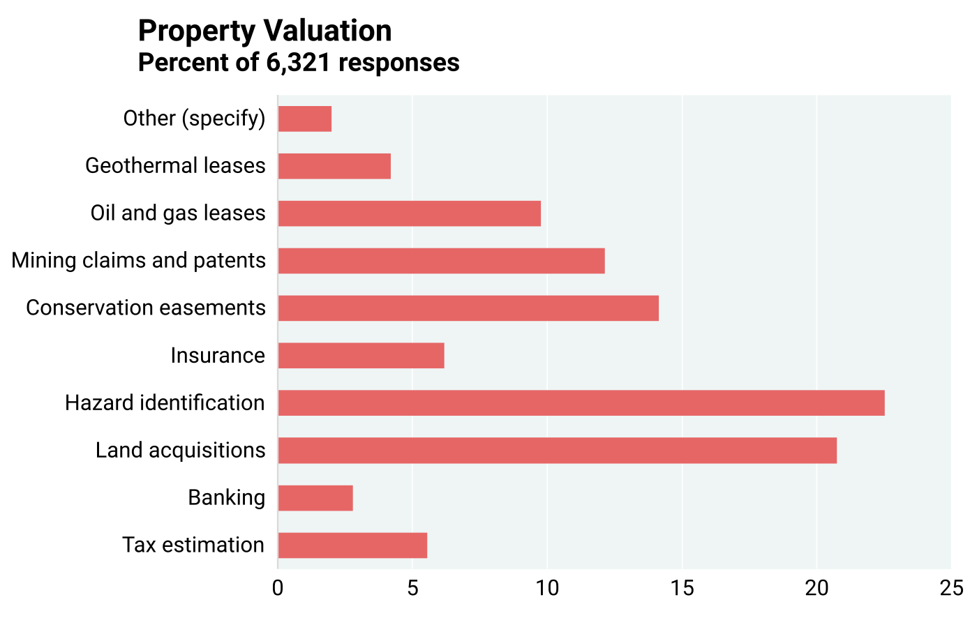
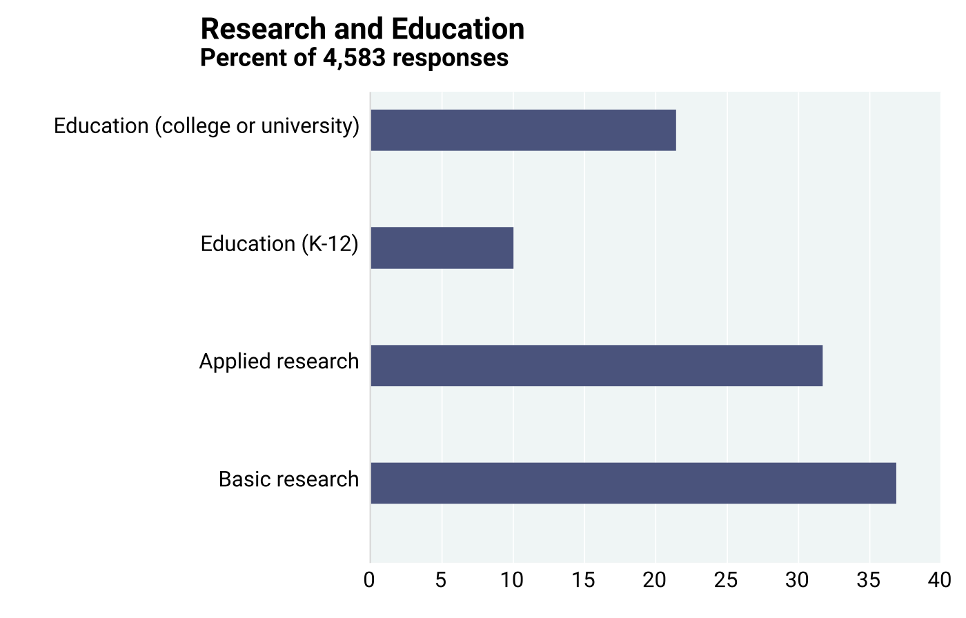
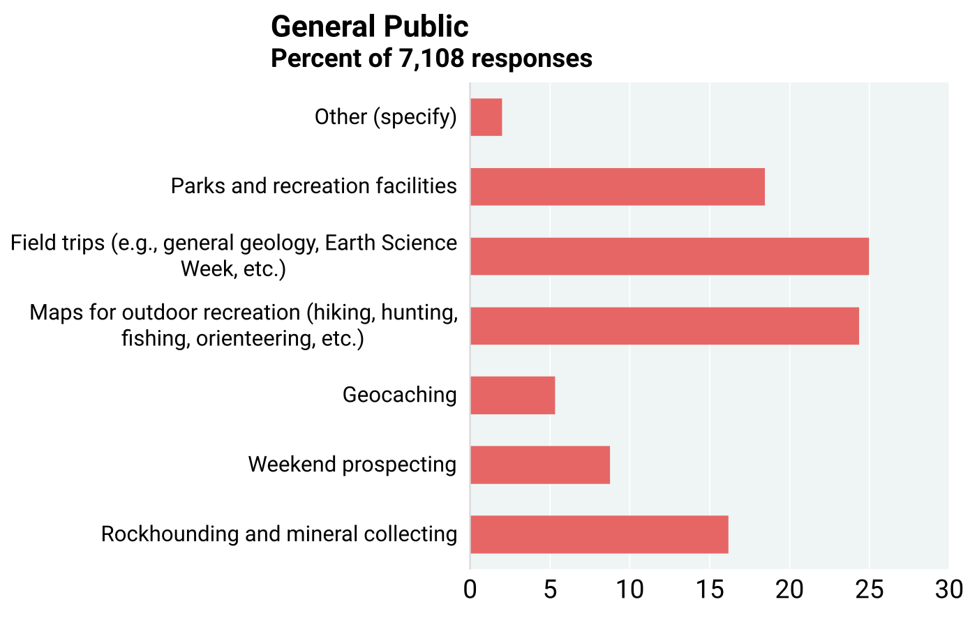
The frequency of choices does not necessarily point to the economic weight of the application in the GDP of the nation (see Chapter 11). Moreover, the economic value of a share in the GDP of a sector may differ from its impact on the environment or public health. For example, industrial minerals are produced in large quantities in all regions of the country but may have a low total value and be a small percentage of the GDP. Yet, their importance for supporting infrastructure is critical. Similarly, the total value of water measured by the price paid by consumers is not high, but its use is vital. Chapter 9 discusses in some detail the economic importance of pollution prevention and remediation.
6.3: Stakeholder Preferences for Map Types and Scales
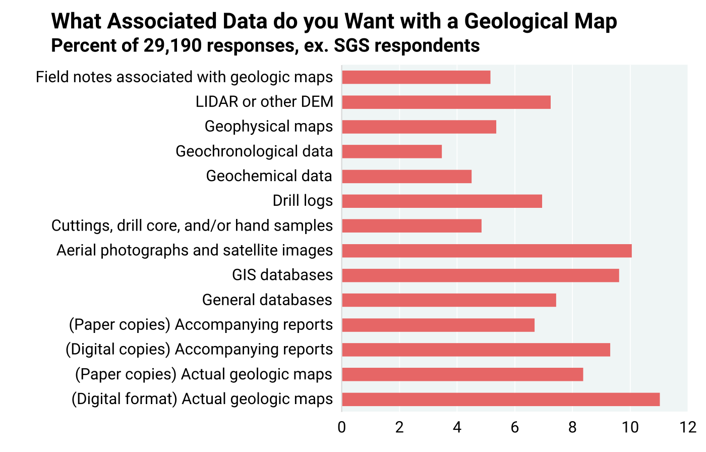
Data provided by SGS and the USGS on web visits indicate that stakeholder preferences regarding the form in which they like to receive geological maps, data, and reports has changed in the past couple of decades. They were asked to express their preferences regarding how they would like to receive this product and what types of products they need (question 4). Respondents were given the choice of selecting multiple ways to obtain geological maps and information. Figure 6.3.1 shows the number of times each of the 14 categories was selected by stakeholders. The total number of responses was 28,190. The number of responses far exceeded the number of respondents indicating that each respondent marked multiple choices. In part, this was a result of the choices that were provided. Five of the fourteen choices were digital or online, two were paper form, and the remaining seven were other forms in which geological information was sought by stakeholders. The response statistics reflect the preference for digital or online access of geological information, as this accounts for about 37% of the responses.
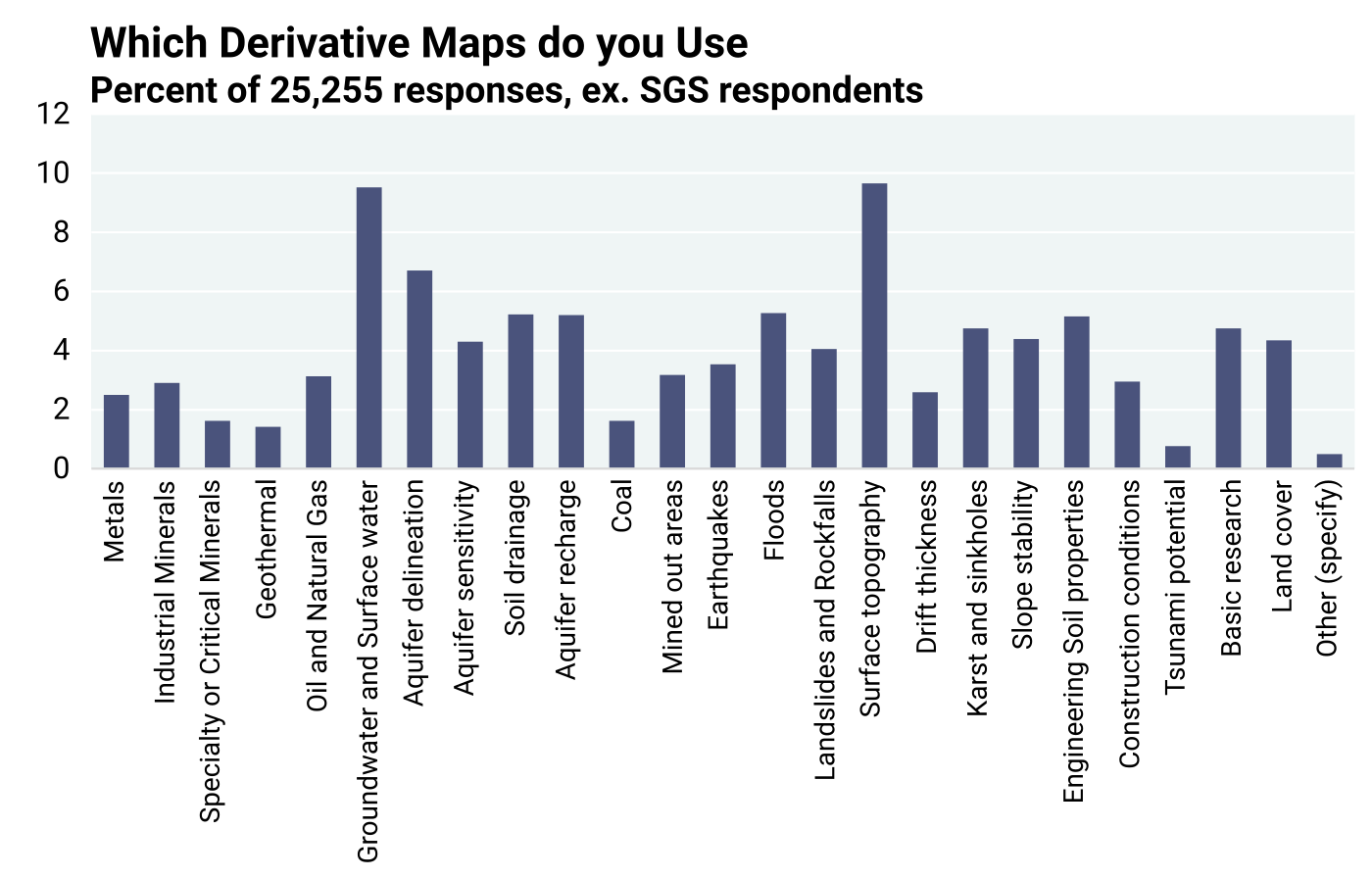
Stakeholders were further asked to provide input on the types of derivative maps that they use (question 5). A total of 25,255 responses were received. Figure 6.3.2 shows the percentages of responses in each category of derivative map. Five derivatives directly concerning water account for 25.8% of the responses. Some other derivatives may also be related to water. Two of the derivatives — surface topography and ground- and surface-water — received high response rates. The need for a derivative map not only motivates its development and production but provides opportunities to project future mapping policies.
Stakeholder needs are best served when maps have required details and specifics (question 12). The total number of responses was 4,943 (Figure 6.3.3). On average, each respondent chose two scales. About 72% of responses indicated the need for maps at the scale of 1:24,000 or larger. This would also suggest that stakeholders may not be looking only at what is available, but primarily at what is desirable.
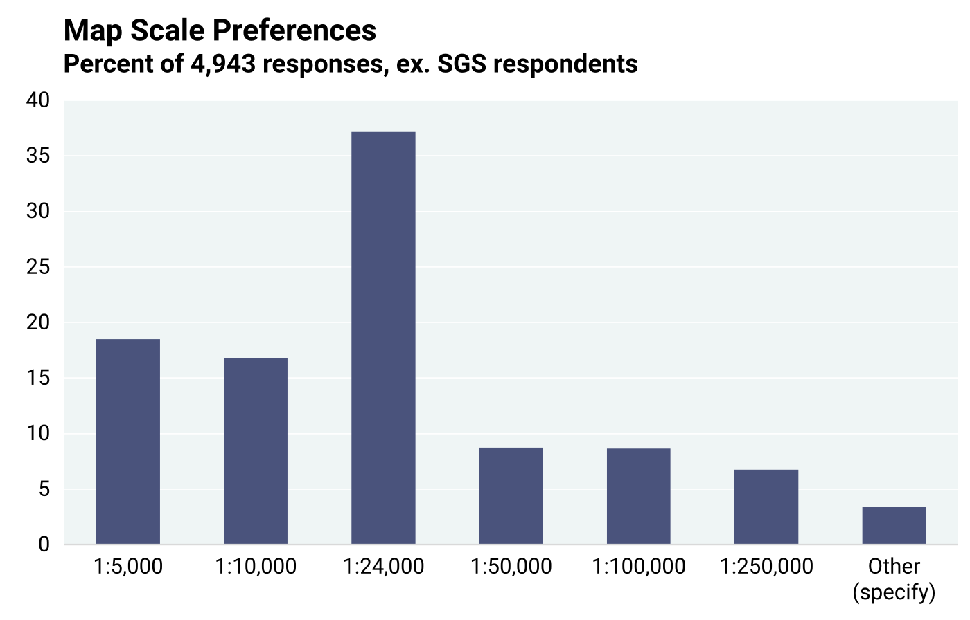
Stakeholders were also asked in a later query to comment about the direction mapping programs should take. One of the frequent responses was the desire to continue mapping at scales of 1:24,000 or larger. The 1:24,000-scale was the preferred scale in previous cost-benefit assessments in Kentucky and Nevada (Bhagwat and Ipe, 2000; Bhagwat, 2014). This scale is adequately detailed to address most societal issues by the preponderance of stakeholders.
The desirability of digital access to various products of geological mapping varies, as seen in Figure 6.3.4 (question 15). Geological map data, such as in a GIS format, is the most preferred product (commonly ranked as “critically important” in the survey), followed by scanned maps and accompanying reports. Based on stakeholder comments, some users appear to prefer creating their own maps and interpreting geological data to fit their needs and purposes. However, digital access to most other geological products is rated “very important” by large numbers of respondents.
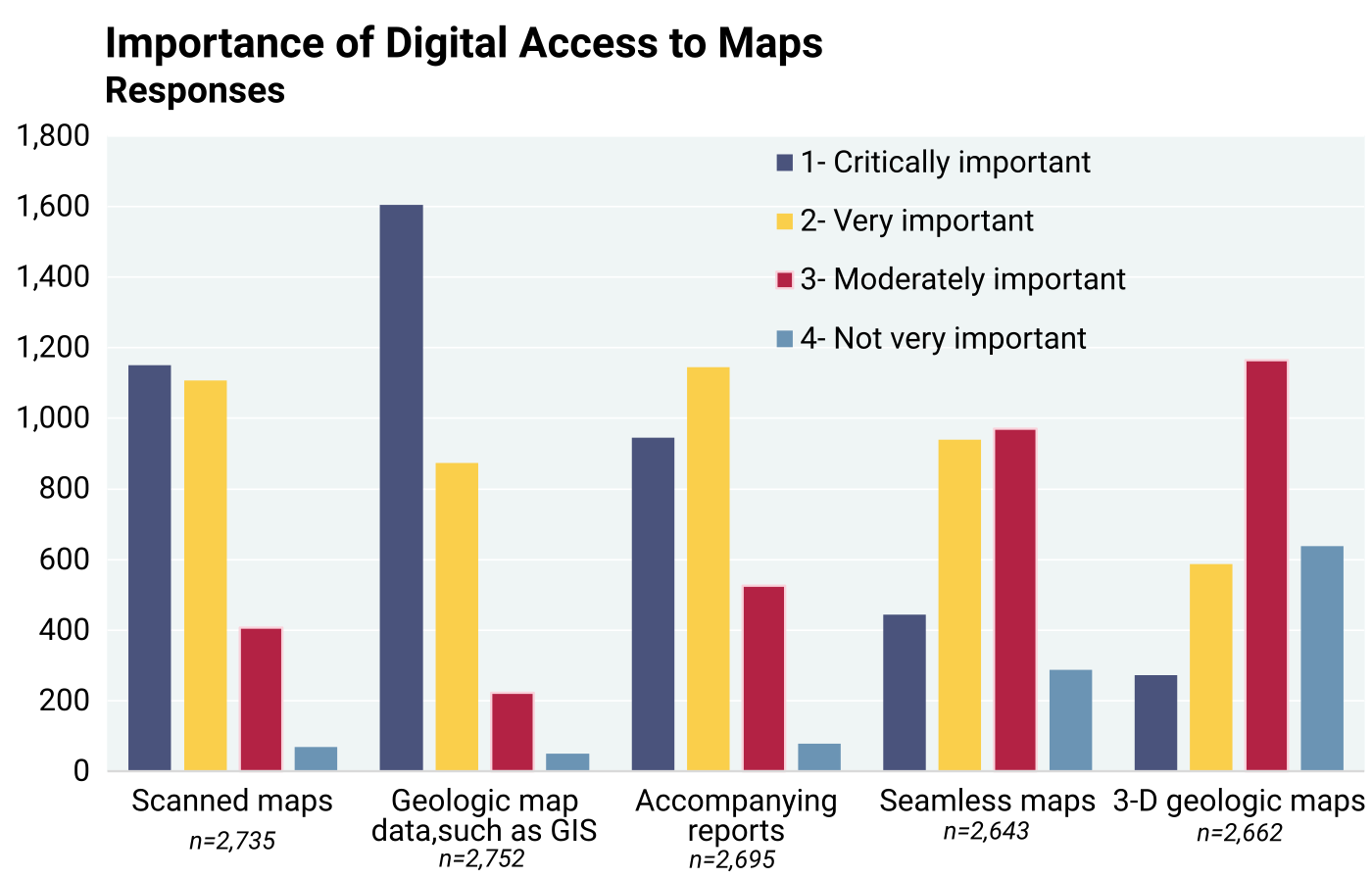
The lower overall perceived importance for seamless maps and 3D (or subsurface) maps may reflect lack of familiarity, and particularly their availability, to stakeholders. Although there has been a significant global increase in 3D mapping (and modeling) over the past 20 years (MacCormack et al., 2019), here in the U.S., only a few SGS, as well as the USGS, are engaged in the activity. Seamless mapping is a newly introduced concept that involves the goal of having uniform geology (surface and subsurface) and map standards from map to map and state to state across the country. Both seamless and 3D geological maps can greatly increase their ability to portray a uniform view of the subsurface. However, not until recently (Brock et al., 2021) have these concepts been included in a national strategy for geological mapping. As mentioned in Chapter 4 that presents the $1.99 billion in geological mapping costs for the 1994–2019 project period, 3D mapping and modeling of the subsurface will increase mapping costs because of the added funds required for obtaining subsurface information (e.g., exploration drilling, geophysics, up-to-date water well and geotechnical databases, etc.). However, increased benefits will also be realized as 3D mapping and modeling lead to (1) improved discovery of energy and critical minerals resources; (2) identification of regions with optimum conditions for CO2 sequestration; (3) better characterization of geothermal potential; (4) a better understanding of geological hazards; and (5) providing a detailed subsurface framework for delineating aquifers, efficient placement of groundwater monitoring wells, and prioritization of areas requiring subsequent groundwater flow modeling.
6.4: Quantitative Assessment of Value of Geological Maps
The assessment of the value of geological maps is as complex as the assessment of the cost of specific maps as described earlier. Stakeholders were provided different ways of assessing the monetary value of geological maps based on personal expertise and experience about what it takes to generate geological maps, as well as how much time and money may be required to create them if they were not made available from institutions like SGS and the USGS. Value assessments are indeed subjective, because geologists and other users of geological maps do not conduct the same investigations with and without available geological maps to judge their monetary value. Geological maps may also be used multiple times for different projects and over long time periods, adding more uncertainty to the estimation of their value. Furthermore, the monetary value of geological maps as assessed by stakeholders can only be understood as unrelated to any specific type, form, or application, but only as a statement of map value in general. One question to stakeholders involved an assessment of time and money saved over a five-year period in terms of percentages of total project cost and time. Another question asked for project specific savings, and yet another question asked directly what they would willingly pay for a map if it was not available from public institutions. Finally, stakeholders were asked to venture an estimate about what amount they would have paid for one map, if not available from publicly funded institutions. They were asked to state a maximum amount, a minimum amount, and a likely amount per map to accommodate the uncertainty involved in the exercise. The questionnaire was designed to ask geological map value questions in several different ways and elicit responses that would bring out the nuances in map use and could be compared for consistency. The basic assumption in sending the questionnaire to stakeholders was that they have, or should have, some utility for knowledge about geology and could therefore estimate the value of geological maps utilized by their organizations or themselves.
There was a wide range of data from stakeholder respondents, usually with dollar value outliers that may have been overestimates of very large, long-term projects. Therefore, median values are considered more representative than the mean values and are reported as such in the below discussion. Basic summary statistics are shown in Appendix 4, including the mean, median, range, and standard deviation for all data points pertaining to time and cost savings, total project costs, number of maps for projects, willingness to pay, long-term map value, and expected payment for a map.
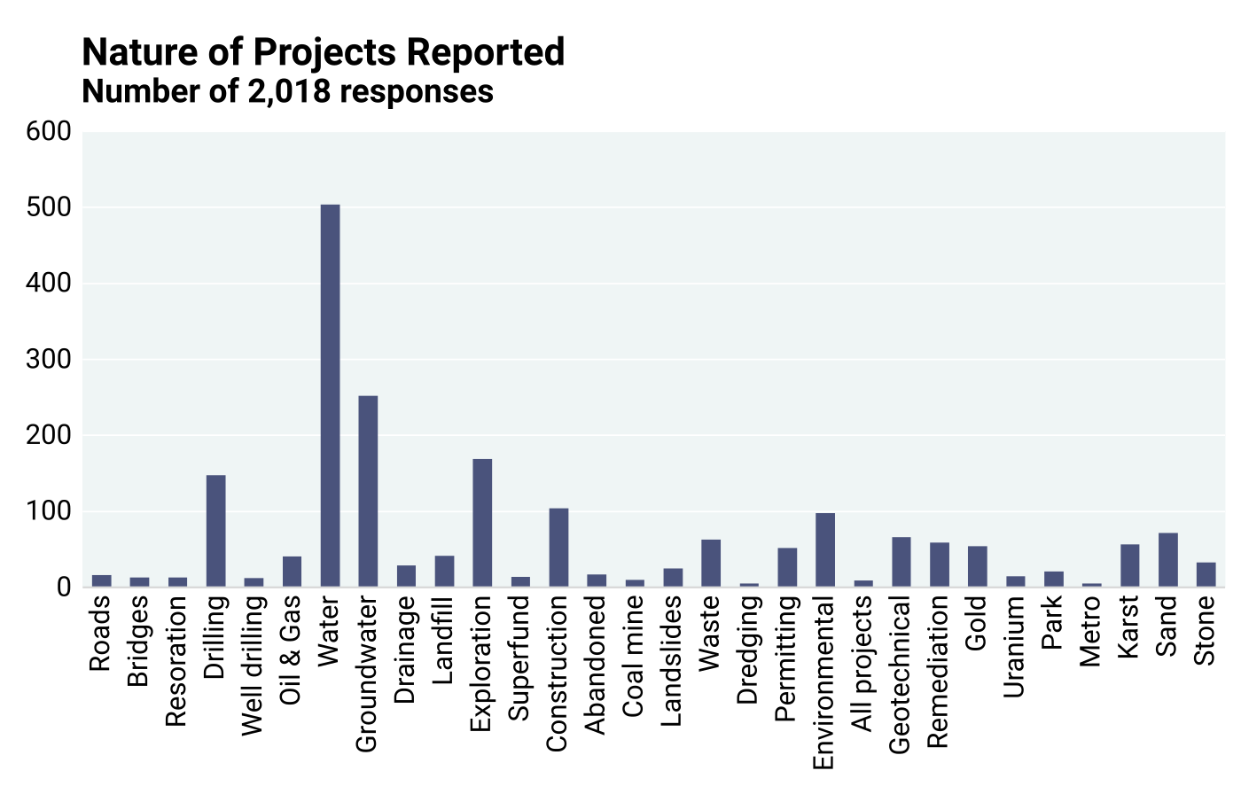
Estimates of time and money saved during the past five years. Having established that the population represented in the responder group comes from a wide swath of the nation’s economy, responders provided an estimate of time and cost savings in the previous five years attributable to the availability of geological maps prepared by scientists at publicly financed institutions such as SGS and the USGS (question 3). The estimated savings were reported as a percent of total time and money that they would have otherwise spent. Information about the specific number of projects or their budgets was not solicited. However, Figure 6.4.1, based on a random word search to ascertain the nature of reported projects, highlights the breadth of geological mapping applications for various practical uses. As with all estimates provided by the responders in this study, it is understood that they are not based on actual comparisons of time spent and costs incurred with and without the maps because such cases, if existing, would be exceptionally rare.
About 6.5% of responders indicated no time saving (Figure 6.4.2). One major reason why no time was saved could be that geological factors played a small role in their project. The median time saved based on all responses was about 20%. Because of the wording of the question, it is not possible to save more than 100% of the project time. An Interquartile Range* analysis was performed to determine statistical outliers. No low-end outlier was determined. However, 5% of responses with time savings above 67.5% were flagged as high-end outliers.
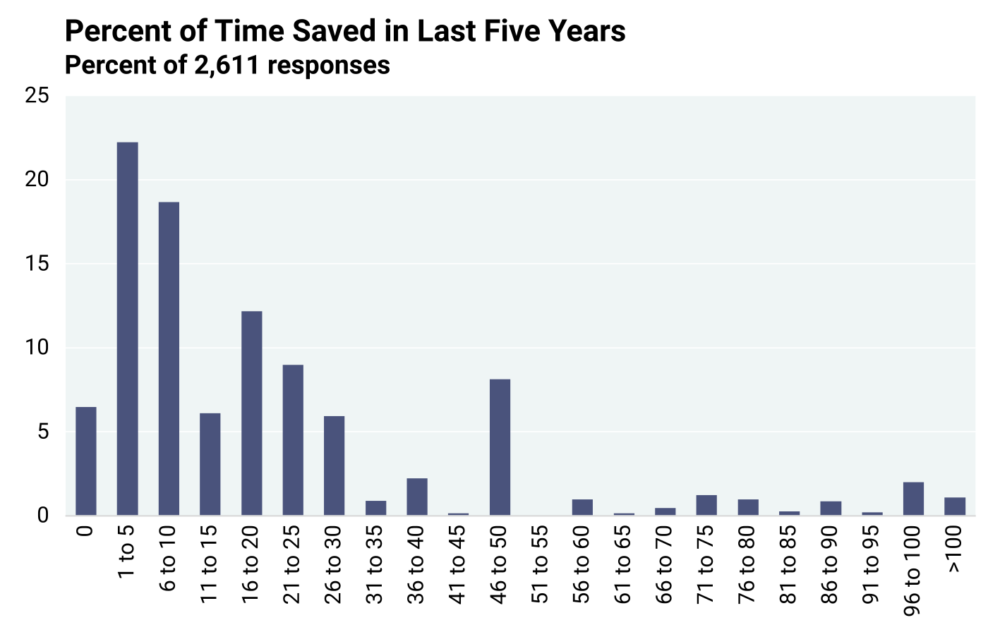
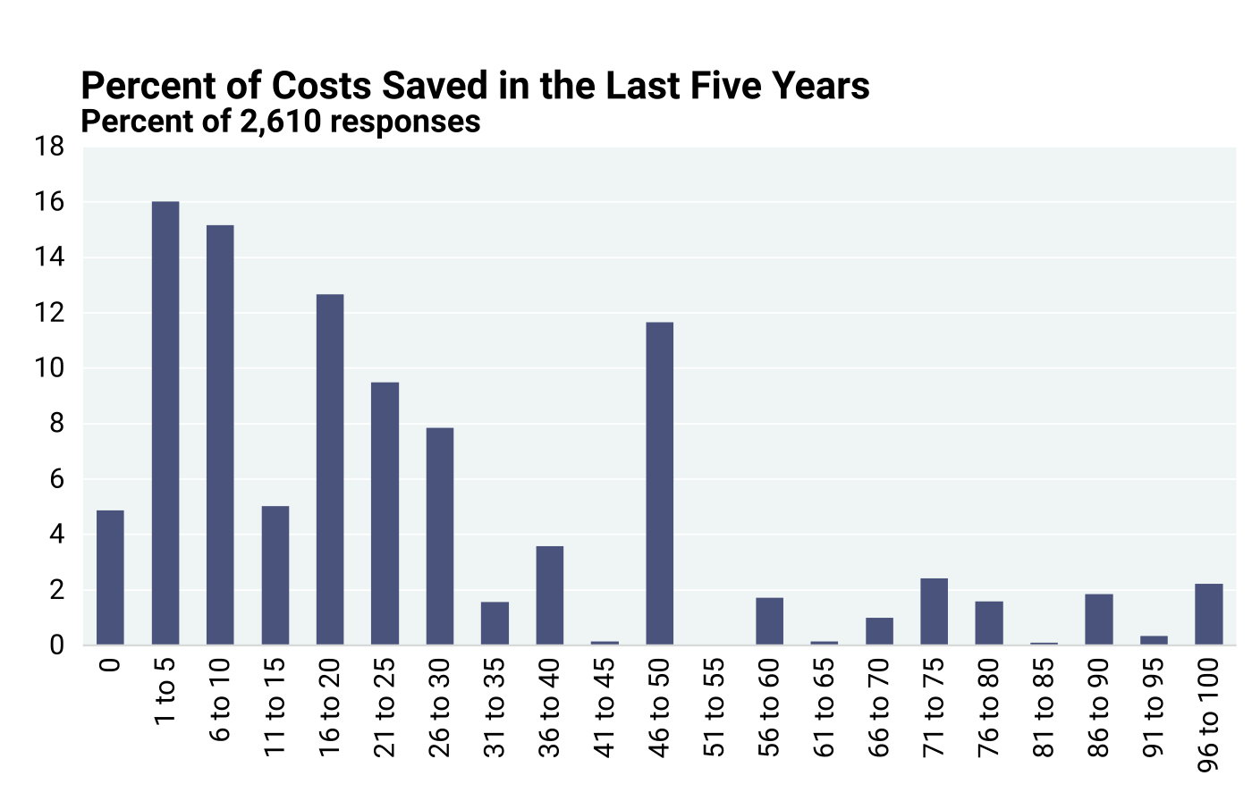
Figure 6.4.3 is a graphical depiction of estimated cost savings and expectedly shows a pattern like that in Figure 6.4.2. About 6.5% reported no cost savings, 22.2% reported cost savings from 1–5%, and 18.7% reported 6–10% cost savings, which add up to 47.4% under 10% cost savings. The median cost savings reported was 15%, and the average cost savings was 20%. Interquartile Analysis (the spread of the middle half of the distribution) flagged 7% of responses at > 67.5% savings as high-end outliers. However, only 1% of responses were > 100%. As savings above 100% make no sense, they need to be ignored. Ignoring responses > 100% did not affect the median savings.
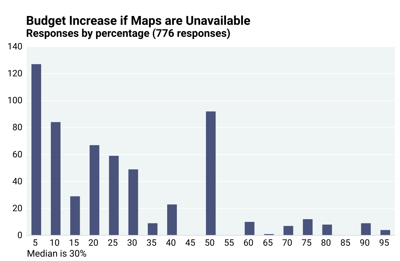
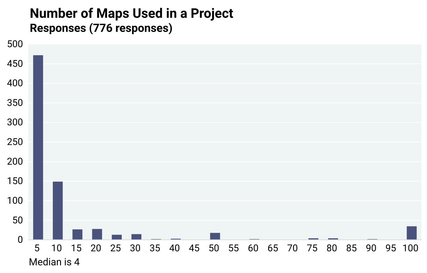
Project cost increase if maps unavailable. Another question to stakeholders (question 7) had three components – (1) question 7A asked to describe a project and provide a budget, if possible; (2) question 7B requested how much (%) higher the budget would be if maps were unavailable; and (3) question 7C asked how many maps were used for the project. A total of 776 responses included all three numbers — the budget, the percent increase in budget without maps, and the number of maps used. Individual responses were used to calculate the dollar amount by which the budget would have increased if maps were not available, and this number was divided by the number of maps used for the project. The result is the “value” attributable to each map. The 776 individual responses were the basis to determine the median per map value.
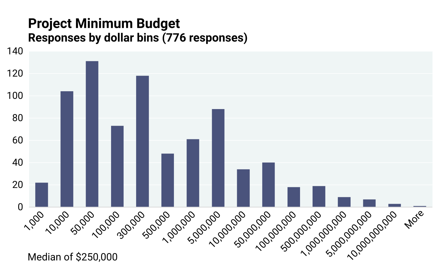
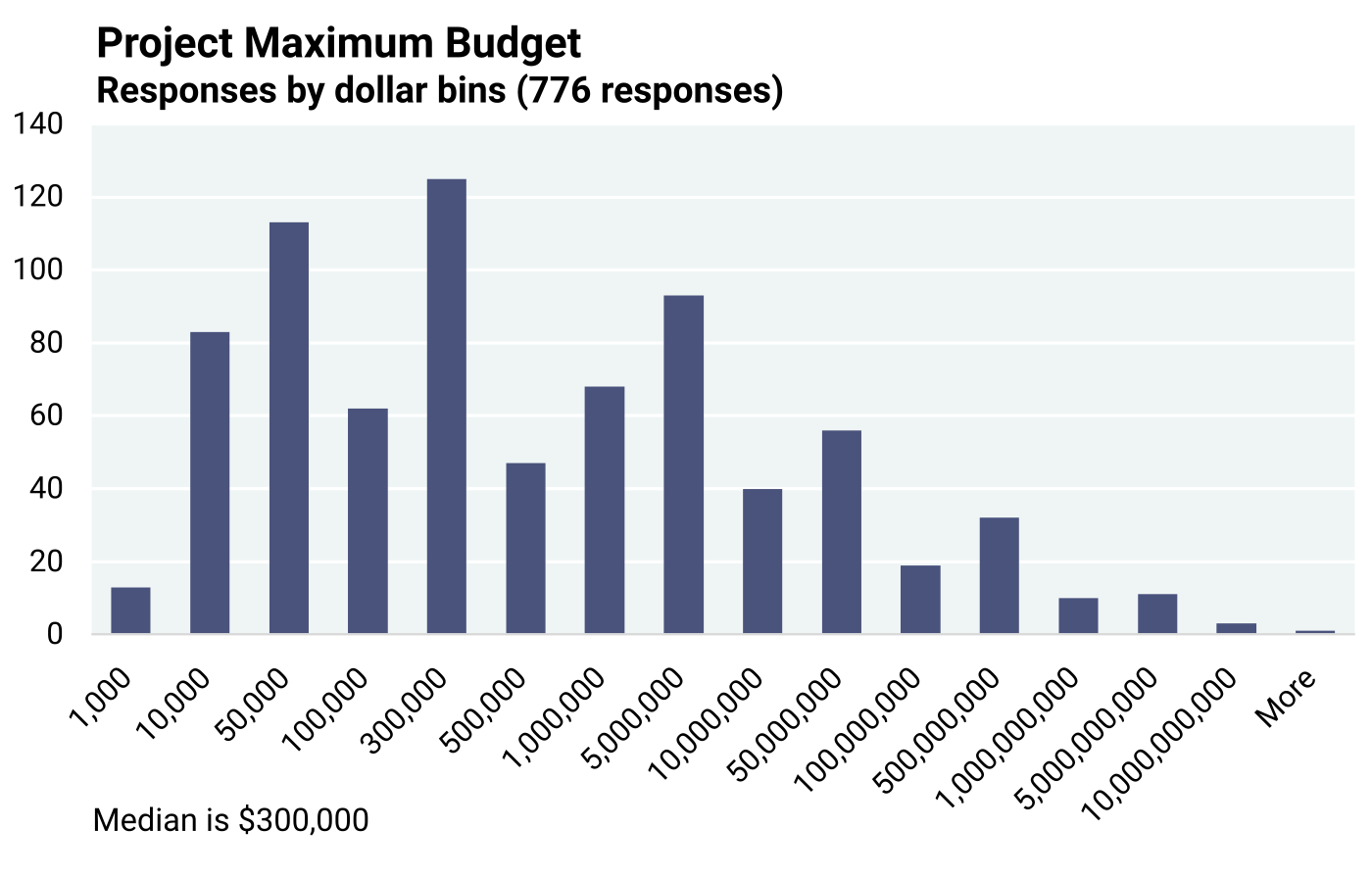
Some responders provided a budget range, while others gave a single dollar figure. Therefore, all calculations were based on the maximum and the minimum budgets reported. The results are shown in the charts below. The median value per map was $11,062 based on minimum project budgets, and $18,275 based on maximum project budgets. The value based on the maximum project budgets ($18,275 per map) is preferred, because budget overruns are not uncommon (Figures 6.4.4 through 6.4.7). Interquartile Analysis flagged high budget outliers above $311,250 or $697,750, respectively, for the minimum budgets and maximum budgets that were reported by the respondents. However, outliers were not excluded, because they had no effect on the calculation of the median value.
Figures 6.4.6 and 6.4.7 show the frequencies with which the budget would increase by a specific percentage and the number of maps used, respectively (question 7B). Interquartile Range Analysis indicated that about 11.6% of the 776 responses were > 210% and may be considered high outliers. The median budget increase was 30%.
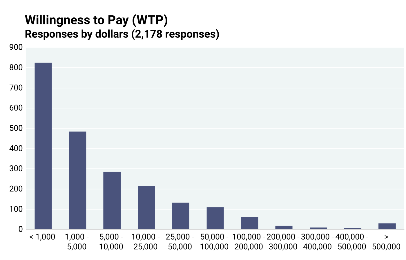
Willingness to pay for one map. A more direct approach was taken in another question (question 8) to stakeholders in which they were asked what they would willingly pay for having ONE map constructed if it was not available from publicly financed institutions. They were asked to select from several price ranges.
To calculate the price that stakeholders would willingly pay, it was assumed that choices within each price range are uniformly distributed, and each price range is represented by its center value. For example, all responses in the $50,000–$100,000 category were assumed to be equal to $75,000 per map. The responses from 2,178 stakeholders are graphically presented in Figure 6.4.8. The median willingness to pay (WTP) for one map was $3,000.
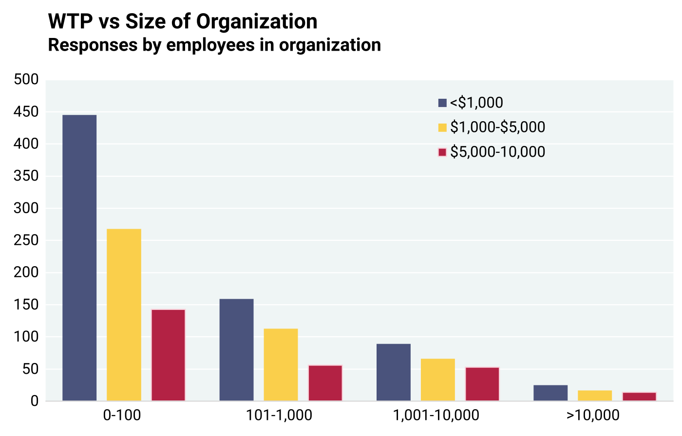
To test if organizations that employ fewer people were willing to pay less for a map than the larger organizations, responses to employment (question 1C in Appendix 2) and WTP (question 8 in Appendix 2) were filtered as follows:
-
Employment in organizations from which respondents would willingly pay (WTP) < $1,000 for one map;
-
Employment in organizations from which respondents would willingly pay $1,000–$5,000 for one map;
-
Employment in organizations from which respondents would willingly pay $5,000–$10,000 for one map;
The four groups of columns in Figure 6.4.9 represent organizations with an increasing number of employees. The blue column in each group shows how many individuals would willingly pay up to $1,000 for a map. The orange column indicates the number willing to pay $1,000 to $5,000 for one map, and the red column stands for those willing to pay $5,000 to $10,000 for one map.
Figure 6.4.9 data show that most respondents (59%) came from small organizations employing <100 persons. Their number declines with the size of organization, as 3.9% of respondents belonged to the largest organizations with >10,000 employees. Each set of columns shows the distribution of what the respondents would pay for a map. In each set of columns, the blue column shows the smallest willingness to pay:
-
Respondents from very large organizations (>10,000 employees) — 44.6% would pay <$1,000 for a map.
-
Respondents from large size organizations (1,001 to 10,000 employees) — 42.8% would pay <$1,000.
-
Respondents from medium size organizations (101 to 1,000) — 48.5% would pay <$1,000.
-
Respondents from small size organizations (100 or less employees) — 52% would pay <$1,000.
In all company sizes, the highest percentage of respondents would pay <$1,000, and the lowest percentage would pay $5,000-$10,000. For those who would pay <$1,000 for a map, an average of 43.7% were from very large and large organizations, whereas an average of 50.3% were from medium and small organizations. It is understandable that a higher percentage of smaller organizations would pay <$1,000 for geological maps than larger organizations. However, percentages are remarkably similar among all four organizational sizes.
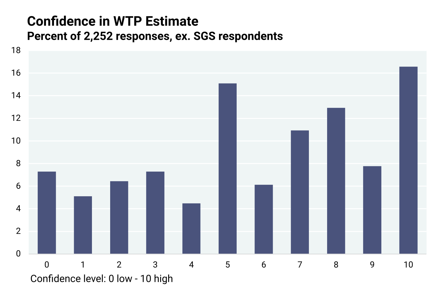
After assessing the value of geological maps, the stakeholders were asked to state how confident they felt about their answers on a scale of 0 to 10, ten being the highest certainty (question 9). Their responses are graphically shown in Figure 6.4.10.
The data in Figure 6.4.10 indicate that stakeholders are generally more confident than not, as 54.3% indicated a confidence level higher than 5, 30.6% responded with a lower than 5 confidence level, and 15.1% indicated a confidence level of 5. The mean confidence level was 5.85. The confidence level trend above level 5 is generally greater, whereas it is largely consistent below level 5.
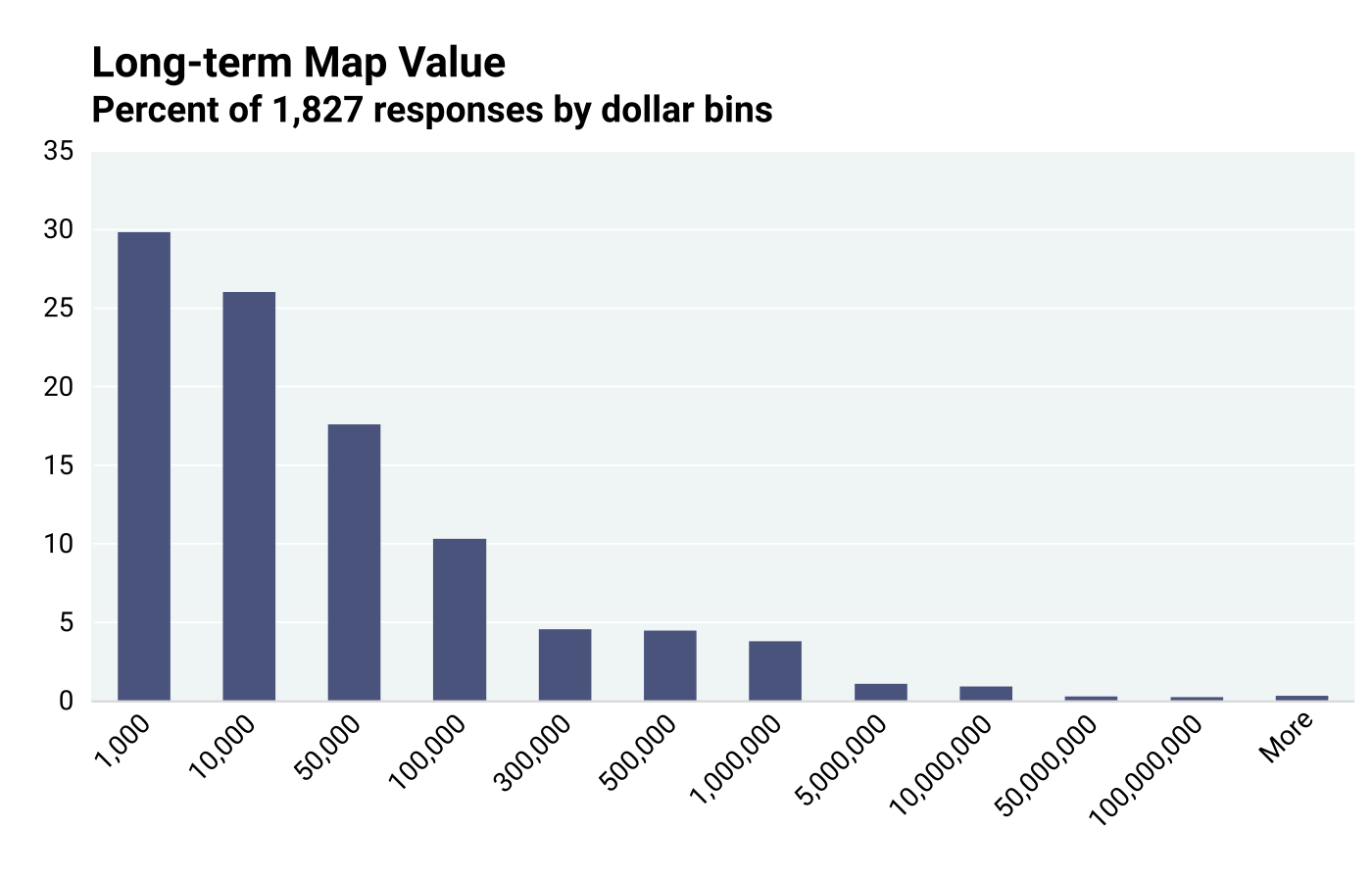
Long-term value of geological maps. A geological map may be used in more than one project, by more than one person, and over many years. It serves multiple objectives for a long time, delivering benefits to users (question 10). Stakeholders were asked to provide their assessment of the long-term value of geological maps (question 10). Unlike previous queries, no value ranges were provided from which to choose, and stakeholders could state any dollar amount that they felt appropriate. Figure 6.4.11 depicts the same data re-organized into bins of values, which help visualize the probability distribution. Interquartile Analysis indicated that the median long-term value is $10,000, with high outliers above $248,500.
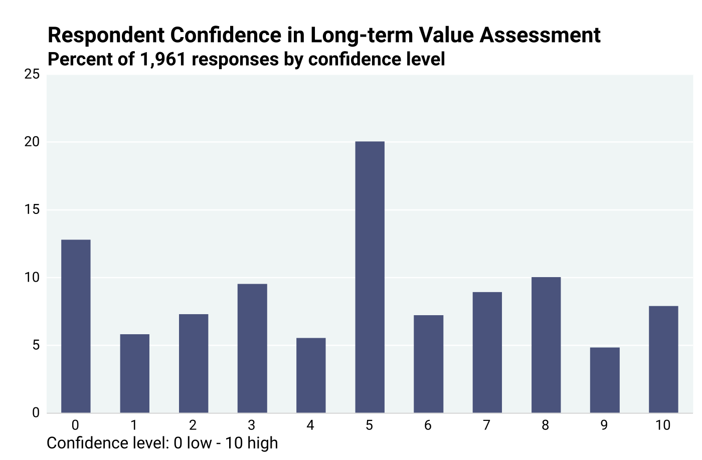
Respondent confidence in their long-term value assessment is understandably lower because they were asked to predict the future, as data in Figure 6.4.12 show. About 41% of respondents, including those with no confidence at all, indicated confidence levels <5, about 39% indicated confidence levels >5, and about 20% indicated 5.
Expected payment for a map. Stakeholders were then asked how much they would typically have to spend to acquire a map if it were not available publicly (question 17). Previously in question 8, they were provided with broad value ranges from which to choose. In this step, stakeholders were asked to provide a maximum, minimum, and a likely amount they would pay. They were free to quote any dollar value. The likelihood or probability that the “real” value would fall between the minimum and the maximum is assumed to be 100%. However, the exact probability distribution in such cases is unknown. Using the three data points, a simplified triangular probability distribution is used as the most practical approach. A triangular probability distribution is commonly used in risk analysis (Rodger and Petch, 1999). Although a probable or likely estimate is offered, the “expected” value is not necessarily the same. According to Rodger and Petch (1999), the expected value is determined by averaging the maximum, minimum, and likely values:
Expected value = (Maximum + Minimum + Likely)/3.
In Figure 6.4.13, the expected values are presented in randomly chosen bin sizes for ease of visualization. About 7.5% assigned $0 value to a map, and 5.2% exceeded $100,000 per map. There were no restrictions imposed on respondents regarding their value assignment.
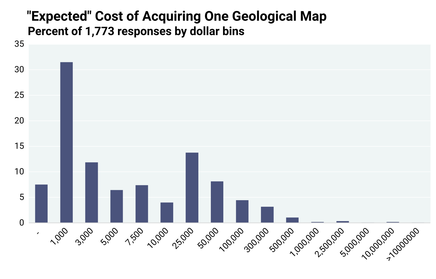
Using the triangular probability distribution approach, the median expected value of one geological map from the responses of 1,773 stakeholders was $2,883. Values > $37,300 were flagged as high outliers by Interquartile Analysis. This $2,883 number is considered the best data for deriving the most accurate value of an individual use of one geological map, because uncertainty is reduced and respondents guessing is minimized. Chapter 7 will discuss that when cost is factored with demand numbers, this $2,883 median expected payment for one geological map was chosen to represent not only the best data but also the most conservative value.
6.5: Summary of Quantitative Benefits Assessment
Table 6.5.1 summarizes the quantitative responses in assessing cost savings and respondent map value perceptions. The foregoing discussion documents that the results from responses to the various queries differed significantly. The variance is expected, because (1) each query has a different reference point; (2) the responses are estimates and not specific to any type or scale of map; and (3) estimates are not necessarily the result of the actual experience of the respondents. Due to the wide range of data, usually with high-value outliers that may have been overestimates of very large long-term projects, the median values are considered more representative than the mean values. The median values obtained from various questions are tabulated below.
In question 7, respondents were asked to estimate how much more time and money they would have to pay for their project if maps were unavailable. In question 10, they were asked to estimate the long-term value of a map. In both cases they were not asked what they would pay. Their responses to questions 7 and 10 are indicative of map value. In comparison, questions 8 and 17 specifically asked what the respondent would pay for a map. The Table 6.5.1 summary indicates that the median value assessments from question 7, based on the estimated impact on project budget due to map availability, and question 10 based on the long-term value of a map ($11,062 and $10,000) are close to each other and are distinctly higher than the median willingness to pay from questions 8 and 17 ($3,000 and $2,883, respectively). In its extreme case is the “free rider” syndrome, where a consumer knows the value of a public good, such as a park, but expects free, or a very low, entry fee. In general, we expect that a purchase is worth at least as much but preferably more than its price indicates.
An important overarching conclusion is that geological maps have high value as measured from several different perspectives and that these high values involve individual applications of those maps. Moreover, as noted earlier, geological maps are a public good, are not consumed after use, and are typically utilized in many different projects and applications, with overall value accruing significantly through time.
Table 6.5.1. Summary of Quantitative Evaluations by Respondents.
| Question 3: Time/Cost saved over 5 years |
|
| Question 7: Project cost increase if maps unavailable; responses included maximum and minimum budget statements. |
|
| Question 8: WTP for a map if not available (choices of $ bins) |
|
| Question 10: Long-term value of a map |
|
| Question 17: Expected payment for a map (free to select any amounts) |
|
6.6: References
Bhagwat, S.B., and Ipe, V.C., 2000, Economic benefits of detailed geologic mapping to Kentucky: Illinois State Geological Survey, Special Report 3, 48 p.
Bhagwat, S.B., 2014, The Nevada Bureau of Mines and Geology, University of Nevada, Reno: Current and future benefits to the university, the state, and the region: Nevada Bureau of Mines and Geology, University of Nevada, Reno Special Publication 38, 64 p. https://pubs.nbmg.unr.edu/NBMG-current-and-future-p/sp038.htm
MacCormack, K.E., Berg, R.C., Kessler, H., Russell, H.A.J., and Thorleifson, L.H., 2019, 2019 synopsis of current three-dimensional geological mapping and modelling in geological survey organizations: Alberta Energy Regulator/Alberta Geological Survey AER/AGS Special Report 112, 307 p.
Rodger, C. and Petch, J., 1999. Uncertainty & Risk Analysis: Business Dynamics, April 1999, Price Waterhouse Cooper, p. 13.
Table of Contents
- Abstract
- Acknowledgements
- Executive Summary
- Chapter 1: Introduction
- Chapter 2: Study Objectives and Methodology
- Chapter 3: Stakeholder Assessment of Map Producing Agencies
- Chapter 4: Cost for Geological Mapping
- Chapter 5: Geological Mapping Program Activities — Critical Components
- Chapter 6: Benefits of Geological Mapping: Quantitative Assessment of Responses to Stakeholder Questionnaire
- Chapter 7: Geological Map Demand and Economic Estimates of Costs and Benefits
- Chapter 8: Regional Variations in Costs and Benefits of Geological Mapping
- Chapter 9: Quantitative Value Assessment from Independent EPA Data
- Chapter 10: Qualitative Assessment of Value of Geological Maps by Stakeholders
- Chapter 11: An Economic Model of General Geological Mapping Applications
- Chapter 12: Stakeholder Input about Future Geological Mapping
- Chapter 13: Lessons Learned and Suggestions for Future Analyses
- Chapter 14: Summary and Conclusions
- Appendix 1: Cost Sheet Template
- Appendix 2: Questionnaire to Stakeholders
- Appendix 3: Example Solication Letter Requesting Stakeholders to Participate in National Cost-Benefit Assessment
- Appendix 4: Summary Statistics, Outliers, and Confidence Intervals
- Appendix 5: Annual State Geological Survey Map Views
- Appendix 6: Regional Cost-Benefit Analysis Datasets
- Appendix 6a: Questionnaire Data Schema
- Appendix 6b: State Geological Survey Reporting Schema
- Appendix 7: Chapter 8 Supplemental Figures and Tables
