Chapter 8: Regional Variations in Costs and Benefits of Geological Mapping
Abstract
This chapter examines regional variations in the economic analysis of geological maps in the U.S. through separate analyses of the stakeholder survey and historical expenditure data. Respondents to the stakeholder survey indicated that geological maps provided a positive net benefit across six designated regions of the country. Public and private sectors generally valued the maps similarly, with private stakeholders placing a slightly higher value in some regions. Responses revealed a high percentage of positive long-term value (71% to 87%) from both sectors. Additionally, the average perceived cost savings by stakeholders were estimated to range from $11,000 to $30,000, with the Intermountain West region having the highest savings and the South-Central region the lowest.
A second analysis confirmed a trend: the more complex a geological map (finer scale), the higher the expense of production. Limitations include potential under-reporting of map data and the time gap between funding allocation and map production. The estimated average map cost ranged from $42,000 to $123,000 for detailed to intermediate scale maps, with the Southeast region having the lowest costs and the Pacific Rim region the highest.
Finally, projected map costs were compared to actual documented geological map costs using two examples: (1) 2019 Illinois State Geological Survey (ISGS) large-scale costs, and (2) 2019 U.S. Geological Survey (USGS) average large-scale costs for all State Geological Surveys (SGS) that received USGS funding for mapping. The statistical data on mapping costs provided by the ISGS and USGS both align with the projected regional historical map cost analysis reported in this chapter. This consistency reinforces a general trend in map production costs. Overall, the chapter highlights the value of geological maps while acknowledging the importance of considering variations in cost related to either the region or map complexity.
8.1: Introduction
In this chapter, we recognize that geological and economic conditions in the United States show regional variations. To analyze the extent of the variability, the country was divided into six regions as shown in Figure 8.1.1.
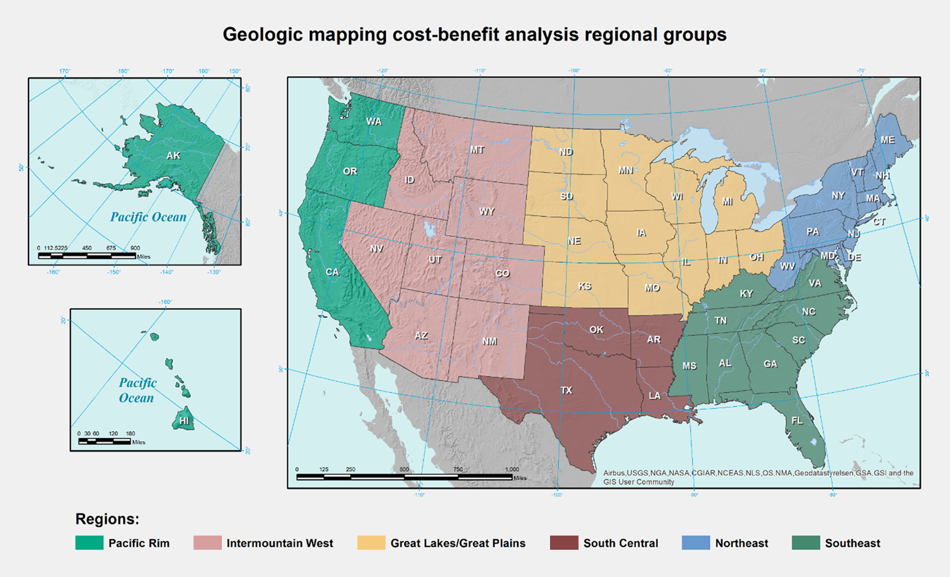
The stakeholder survey was not intended to ask stakeholders about mapping costs. Mapping costs were instead documented by the U.S. Geological Survey (USGS) and State Geological Surveys (SGS) each year from 1994 to 2019. However, it was noticed that the wording of two of the questions in the stakeholder questionnaire, question 16 and question 17 (Appendix 2), had the potential for being interpreted as asking for mapping cost estimates. Therefore, in sections 8.2 and 8.3, the responses to question 17 were assumed to be their estimates of mapping costs and were compared to the stated benefits in response to question 10.
This chapter reviews results in four major sections. In section 8.2, the cost and benefit comparisons of both the private and public sectors are discussed for each of the six regions based on the responses to the stakeholder survey questions (Appendix 2). In section 8.3, the public and private sector data are used from the stakeholder survey to compare how responses to questions about mapping benefits vary by region, which is displayed by visual graphs and charts. In section 8.4, an approach was employed to assess the cost of mapping that differs from the methods used in other chapters of this study, as well as the first two sections of this chapter. As Chapter 4 shows, individual SGS reported their mapping expenditures incurred during 1994 to 2019 from federal, state, and other sources (Appendix 1). In section 8.4, expenditures reported by the USGS and SGS are used. In addition, data from the USGS on the number of geological maps produced annually for representative states from each of the six regions are also used to determine the average cost of producing a geological map. However, the cost per map was not compared with the benefits of maps. Lastly, in section 8.5, the true geological mapping costs from the Illinois State Geological Survey (ISGS) and the USGS were compared to the results from section 8.4.
8.2: Determination of Costs and Benefits
The one question posed to stakeholders that appeared closest to a benefit was question 10 that asked, “Considering that your willingness to pay (WTP) for geological maps for a project may be different from their value over a longer period, in your judgment, what would be this long-term value of those geologic maps?” Data interpreted as ‘long-term value’ was best for calculating a stream of dollars spread over a length of time. Using these datasets required making several significant assumptions. First, it was assumed that the values collected in the questionnaire represent a value at ‘Time-Zero’ or present-year dollars. There was no extra data indicating number of years of value. By assuming the data derived from the questionnaire is in present year dollars, no calculations were required for a net present value based on future years.
The cost of producing geological maps is complicated and requires making assumptions about the data that were collected for this analysis. The first assumption is that the questions and answers of the questionnaire to stakeholders should be viewed from the perspective of the respondents. The purpose of the study was to collect information and data from respondents to ascertain the costs and benefits of creating and using geological maps, respectively.
There are two questions related to costs and benefits if maps are unavailable. Question 10 deals with long-term map benefits in the estimation of stakeholders. We note that wording of questions 16 and 17 (Appendix 2) offered the possibility of being interpreted differently than intended. The intent was to elicit stakeholders to estimate the value of geological maps. The question, however, may be interpreted as asking for the cost of a geological map. The questions were worded as follows:
-
Question 16 states: How do you obtain geological maps if these are not available from public or private institutions?
-
Question 17 relates back to question 16 and states: How much would you typically spend for a map in the above case?
To account for the alternative interpretation, we assumed that respondents were stating their estimates of mapping costs in response to question 17. We used responses stated to be the most likely amounts. In many regions, there were several very high values reported for question 10. High values could reflect the nature of the geology that was mapped. Large-scale maps with complex geology will have greater costs of production than those maps that cover areas with simpler geology. The range of responses also indicates that respondents have a range of experience and work in widely different specialties and regions.
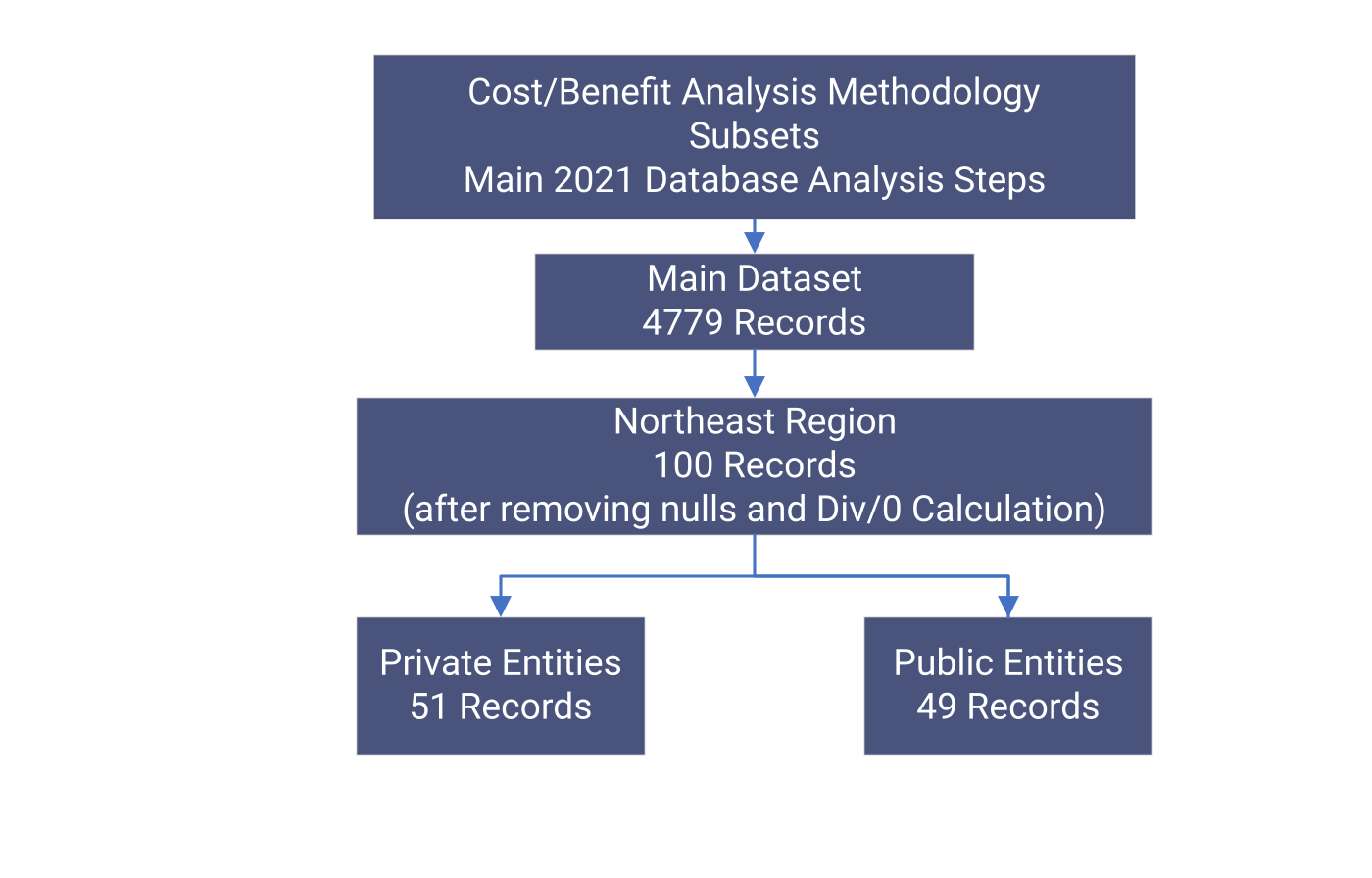
Questionnaire Response Analysis of Cost and Benefit Values: To accurately calculate either a cost or benefit from the current dataset of questionnaire responses, one must have a reasonable number of data points. Figure 8.2.1, for example, shows the data subsets that are created for the Northeast region, separated by geography and public/private ownership in an Access database. Data from Access databases were filtered by query to remove those records that did not have values for state, private, and public fields. The remaining regions are similarly calculated and were used to create Excel spreadsheets. These spreadsheets are located in Appendix 6.
The assumption is that the respondent’s best estimates represent the cost and benefits for the purpose of calculating net benefit divided by net cost of data from the regional queries, as shown on the spreadsheets. Two new columns are added to each spreadsheet, one for cost/benefit values and one for net cost values — net benefit. Only the net-benefit analysis is presented here. The values for cost-benefit analysis are then used to analyze which projects are of higher value than other projects. Negative values are highlighted in red; positive values are in white. A spreadsheet was generated for each private/public scenario for each geographic region, and all are included in this report (Appendix 6).
Cost-Benefit Data Analysis: Table 8.2.1 shows the tabulation of net results (as gleaned from questions 10 and 17), positive or negative, by region, and by private and public groups. The net result is obtained by subtraction of each respondent’s stated costs (question 17) from benefits (question 10). The percentage of positive results by region and organization type was examined for any potential correlation. The only potential correlation identified was that all calculated cost-benefit values show a high percentage of positive values.
The regional net positive results (public and private) ranged from a high of 86.8% to a low of 71.4%. About 13% to 28% of respondents indicated a negative outcome (i.e., costs higher than benefits). Furthermore, only the Pacific Rim region had a higher percent positive net result value for the public sector as compared to the private sector value, albeit by a small margin. This may indicate that, overall, private respondents placed a higher value on geological maps in most regions than did public organizations. This can be correlated to the overall involvement in commercial applications or private sector versus public interest applications by public sector entities. Further analysis requires identifying in each region what types of industries may contribute to high cost-benefit values.
Table 8.2.1 indicates that 71-to-84% of respondents stated that long-term benefits (question 10) were higher than costs (question 17). Table 8.2.1 also indicates that 12 records in the report show the responses to question 10. The median response to question 10 indicated that the long-term map benefit was $10,000 per map. In other words, 71-to-84% of respondents stated that mapping costs (question 17 responses) were lower than the long-term map value.
Table 8.2.1
Overview of the Economic Analysis. The table consists of each regional sector from the questionnaire responses and the sector derivatives. This includes the total number of responses received, the number of responses that were referenced as positive values (benefits), the number of responses that were referenced as negative values (costs), the overall percentage of positive (benefit) responses, the mean cost/benefit (C/B) ratio, and trimmed mean (trim mean) C/B ratio (set to 30%). All calculations and data derived in the cost-benefit analysis are present in Appendix 6.
| Region | # Records | # Positive Values (Benefits) | # Negative Values (Costs) | % Positive Values (Benefits) | Mean C/B Ratio | Trim mean (30%) C/B Ratio |
|---|---|---|---|---|---|---|
| Northeast Public | 49 | 37 | 12 | 75.6 | 1312.56 | 2.68 |
| Northeast Private | 51 | 39 | 12 | 76.5 | 13154.52 | 23.46 |
| Southeast Public | 28 | 20 | 8 | 71.4 | 208.70 | 13.01 |
| Southeast Private | 36 | 29 | 7 | 80.6 | 229.80 | 11.74 |
| Great Lakes/Great Plain Public | 76 | 64 | 12 | 84.2 | 19596.45 | 7.24 |
| Great Lakes/Great Plain Private | 83 | 70 | 13 | 84.3 | 5494.74 | 10.02 |
| South-Central Public | 9 | 7 | 2 | 77.7 | 1125.69 | 18.72 |
| South-Central Private | 23 | 18 | 5 | 78.3 | 763.78 | 3.82 |
| Intermountain West Public | 63 | 48 | 15 | 76.2 | 265688.16 | 7.75 |
| Intermountain West Private | 96 | 77 | 19 | 80.2 | 210.94 | 7.41 |
| Pacific Rim Public | 38 | 33 | 5 | 86.8 | 289.94 | 21.58 |
| Pacific Rim Private | 74 | 62 | 12 | 83.8 | 807.09 | 9.59 |
*Trim mean is a variation of the mean that excludes a certain percentage (30% in this case) of extreme values from both ends of the data set. This is done to account for outliers (unusual but valid data points) that might skew the regular mean. Both the mean and trimmed mean are included in Table 8.2.1 for comparison between the mean C/B ratio values due to these differences.
8.3: Visual Overview of the Regional Economic Analysis of Costs and Benefits
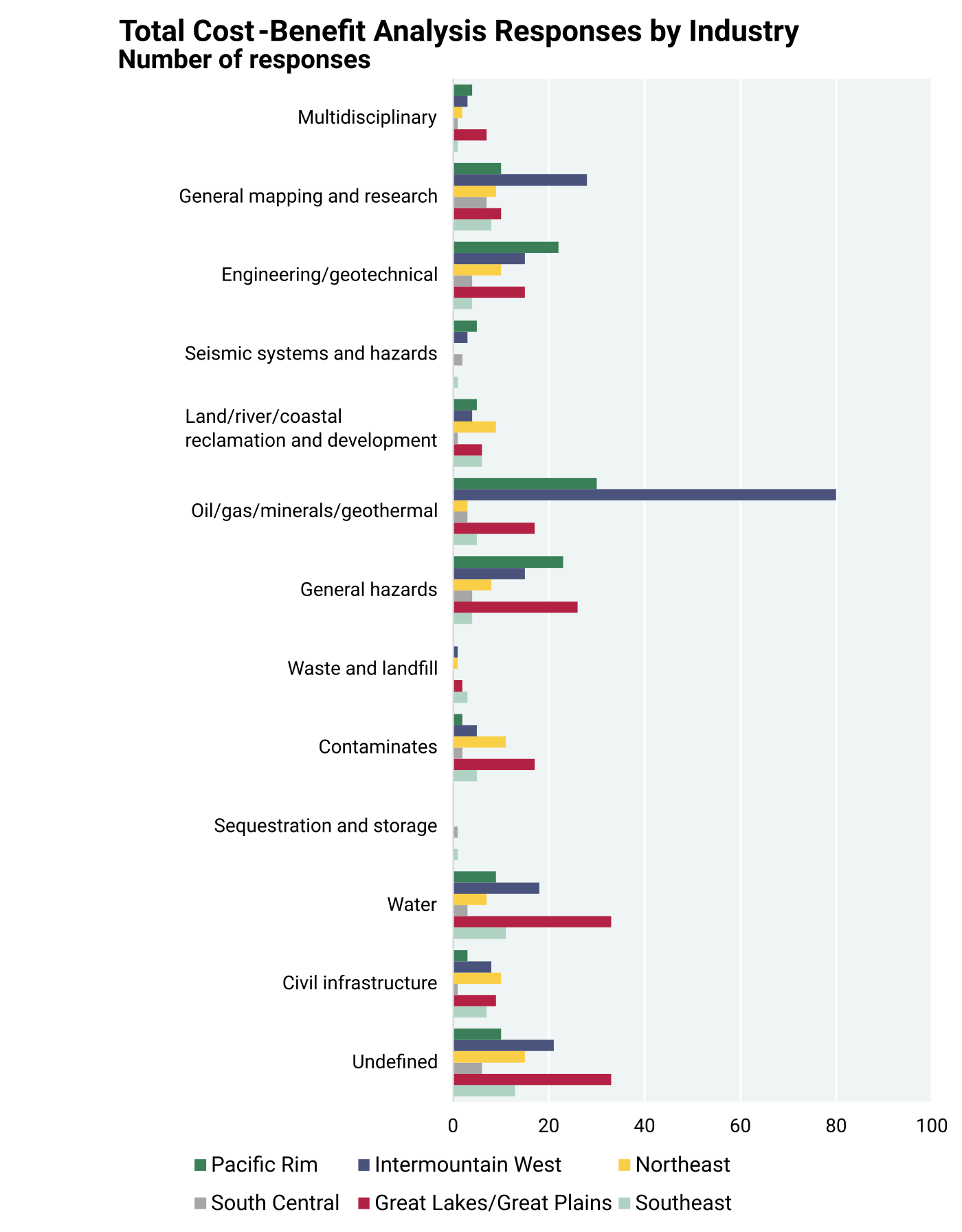
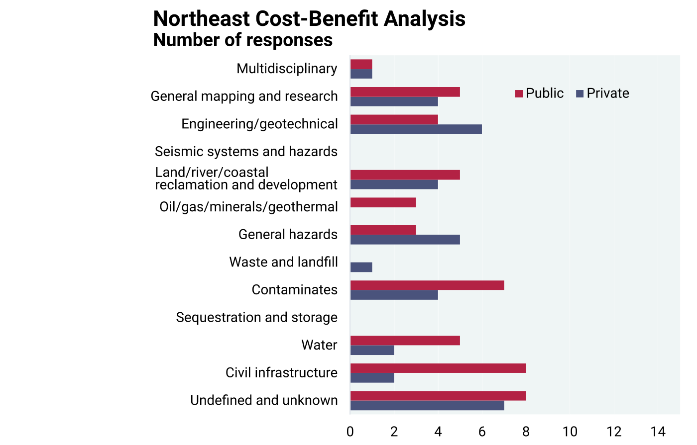
In this section, the regional results from the net benefits in public and private sectors are presented. As stated earlier in the introduction of this chapter, benefits are stakeholder responses to question 10 and costs are their responses to question 17. Because both responses were stated in 2020 dollars, inflation adjustment is not necessary. The total number of industry records and the represented region used in the cost-benefit analysis (Table 8.2.1) are displayed in Figure 8.3.1.
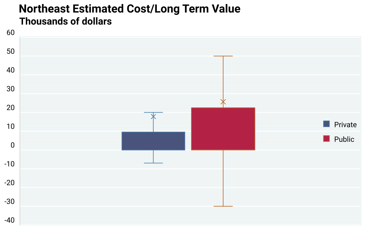
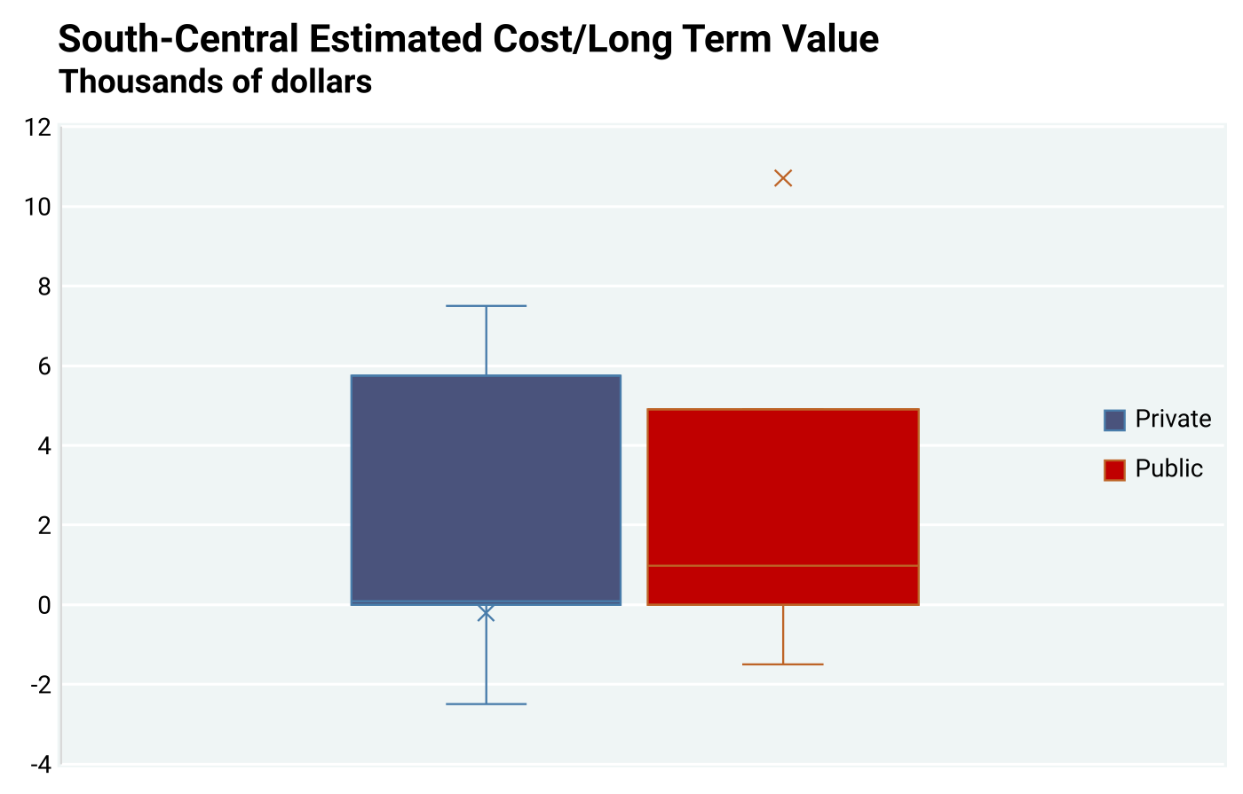
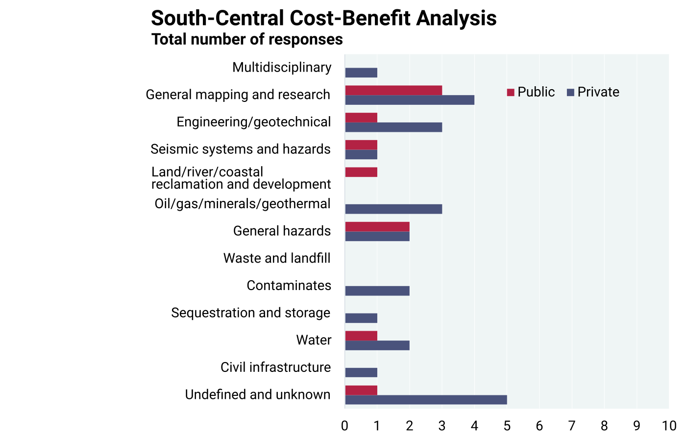
Box and whisker plots were chosen to analyze each of the six regions to help identify and display both the positive and negative results presented in the datasets of the economic analysis of costs and benefits. Additional line charts comparing the industries and the number of records for each region, for both public and private sectors, were also included with the box and whisker plots. Examples of graphs portraying box and whisker plots and the combined number of data responses for each industry are displayed in Figures 8.3.2 and 8.3.3 from the Northeast region and Figures 8.3.4 and 8.3.5 from the South-Central region, and in the other four regions as shown on Figures A7.1 through A7.12 in Appendix 7. Box and whisker plots are an effective method for graphically displaying the median, lower/upper quartiles, and lower/upper extremes of the cost-benefit datasets, thus showing the distribution and variability. Each box and whisker plot also has a corresponding diagram of the number of responses based on both the private sector and public sector from each region. A positive value for X on the box and whisker plots means that, on average, benefits are higher than mapping costs as shown on Figure 8.3.2 from the Northeast region. Negative values for X mean that mapping costs are higher than the benefits from its use as portrayed from the South-Central region on Figure 8.3.4. For the 10 box and whisker charts displayed as Figures 8.3.2, 8.3.4 and in Appendix 7, there are 20 calculations, only one of which (South-Central region) shows a negative value for X. The lowest positive value for X is about $13,000 and the highest positive value for X is about $43,000. However, as mentioned earlier, extremes are not taken into consideration in these plots due to graphical limitations, but they are still valid estimates from respondents.
All data used in the visual overview of this section are derived from the questionnaire dataset, as discussed in section 8.2. The questionnaire and the cost-benefit analysis datasets are in Appendix 2 and Appendix 6, respectively.
The cost-benefit values are represented by the net-costs and the net-benefits. These net-costs and net-benefits, as mentioned in section 8.1, are based on questions 10, 16, and 17. Responses to both questions 16 and 17 are correlated to each other and are interpreted as ‘best estimate’ costs. However, question 10 responses are interpreted as determining a ‘best estimate’ of benefits.
The box and whisker plots derived from calculations do have limitations in that certain regions and organizations have small numbers of responses. Another limitation is the number of outliers in the dataset, as mentioned previously. To help provide a good graphical display of the regional data, each plot was set to show the upper quartile, lower quartile, the mean line, and mean marker. The quartile calculations were derived based on an inclusive median due to the variability in the datasets. All outliers were excluded from the plots. Any cost values greater than $400,000 were interpreted as extreme due to graphical limitations for this section. While these registered values are unusually high or low, they are real in the judgment of the respondents. Tables of these extreme values follow the regional box and whisker plots (Appendix 7, Tables A7.1 through A7.10). Tables 8.3.1 and 8.3.2, again from the Northeast region, serve as examples.
Breaking down the regional dataset even further, some regions had enough data for independent industries to be represented graphically (e.g., the oil/gas/mineral/geothermal industries in the Intermountain West region). However, many other industries (depending on region) did not have an adequate number of responses for values to be represented graphically (e.g., industries in the South-Central region). If adequate response data were available, graphs of industries follow the main regional graphs and tables.
Northeast Region
Table 8.3.1
Positive benefit values (question 10) from private industry sectors determined to be extremes and excluded from the box and whisker plots. The extreme values offset any visible graphics.
| Responder ID | Northeast Private Industry | Extremes |
| 3665 | Civil infrastructure | $19,999,950 |
| 3044 | Land/river/coastal reclamation and development | $480,000 |
| 618 | Engineering/geotechnical | $499,900 |
| 647 | Multidiscipline | $950,000 |
| 3652 | Unknown | $999,500 |
Table 8.3.2
Positive benefit values (question 10) from public sectors determined to be extremes and excluded from the box and whisker plots. The extreme values offset any visible graphics.
| Responder ID | Northeast Public Industry | Extremes |
| 3019 | Contaminates | $799,985 |
| 4484 | Land/river/coastal reclamation and development | $450,000 |
| 3124 | Engineering/geotechnical | $992,500 |
South-Central Region
8.4: Regional Historical Data, Analysis, and Interpretations
The analysis in this section is based on mapping expenditure data from SGS and the USGS obtained for the study and used in previous chapters. It also uses separate data obtained specifically from the USGS for the approximate number of maps constructed annually during that same 1994 to 2019 period for six regional examples. The two datasets are used to determine the average cost per map. We do not calculate net benefits, net losses, or cost-to-benefit ratios in this section. After the discussion of the financial data in the Overview of Regional Historical Data, all state cost data and estimated map costs are adjusted to the 2020 inflation rate for the remainder of this section.
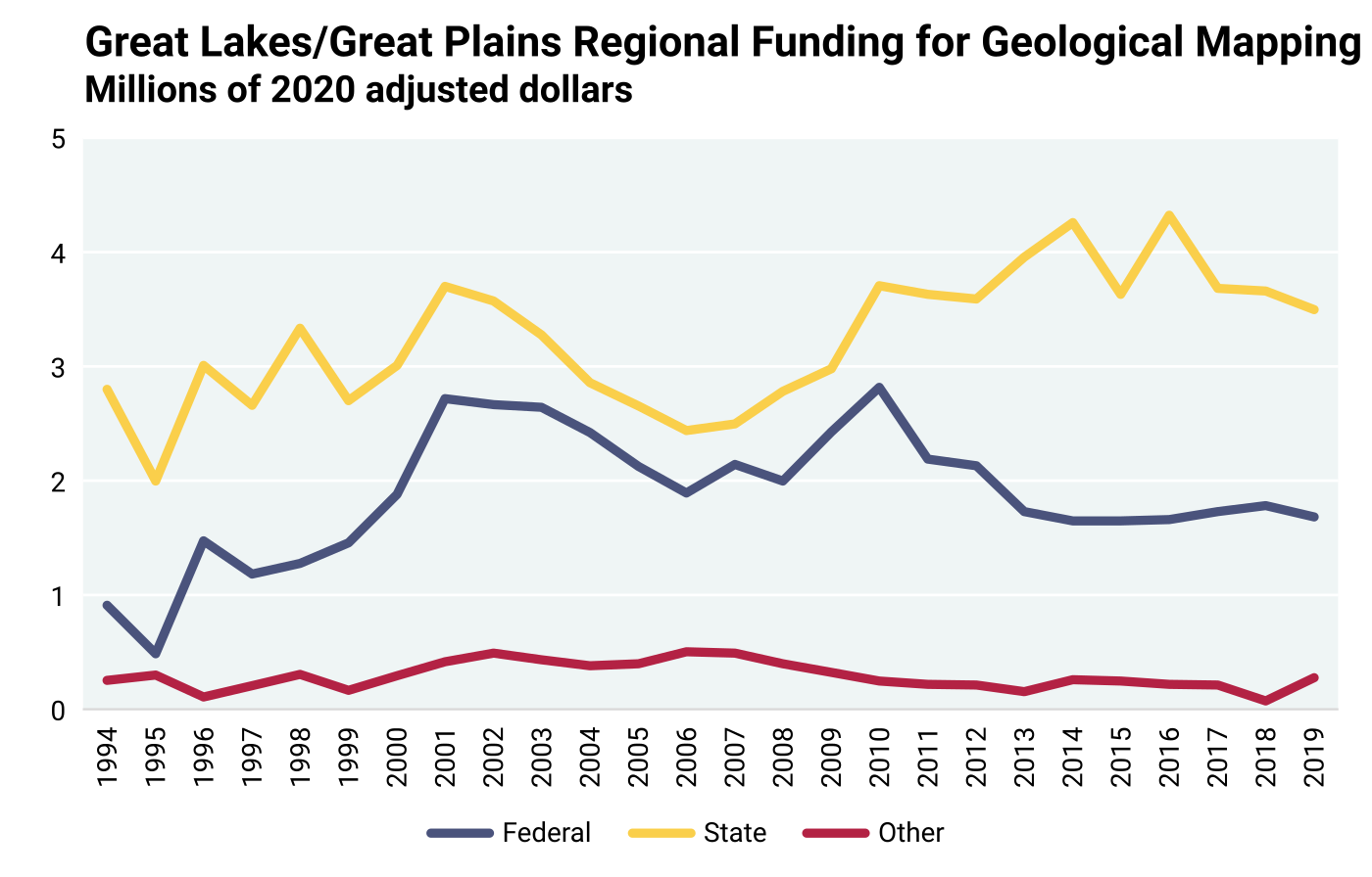
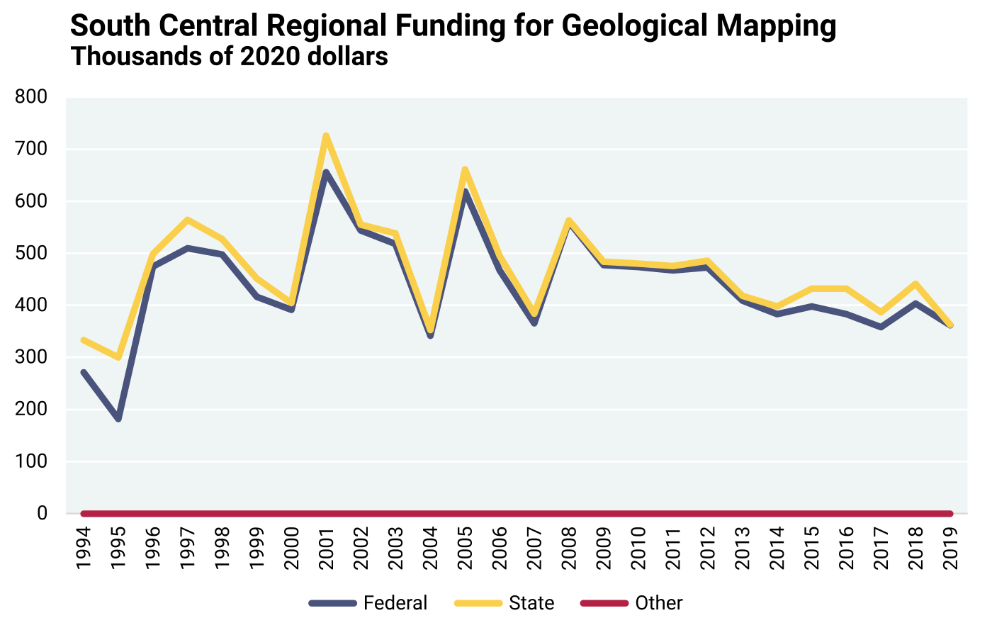
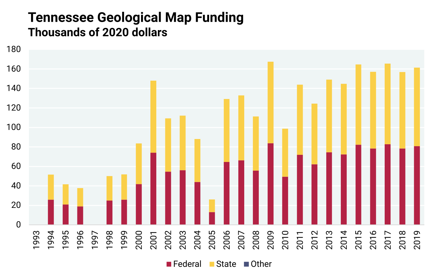
Overview of Regional Historical Data: The 1994–2019 state mapping expenditure data (abbreviated as “state cost data”) from SGS and the USGS were acquired through the first questionnaire distribution (discussed in Chapter 2 “Data Acquisition — Cost Information” and documented in Appendix 6). For the analysis that this section presents, the state cost data are broken up into six regions: Northeast, Southeast, Great Lakes/Great Plains, South-Central, Intermountain West, and Pacific Rim (Figure 8.1.1). The SGS cost data is further grouped into three sections of funding per state: (1) funding provided by the federal government, (2) funding provided by state government, and (3) other funding by third parties. “Other” parties may consist of local government agencies or private industries that provided funding for geological mapping. The analysis in this section was limited to geological maps ranging in scale from 24K to 100K to account for greater geological complexities.
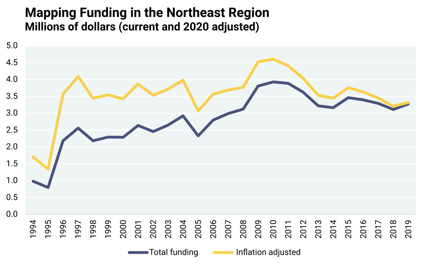
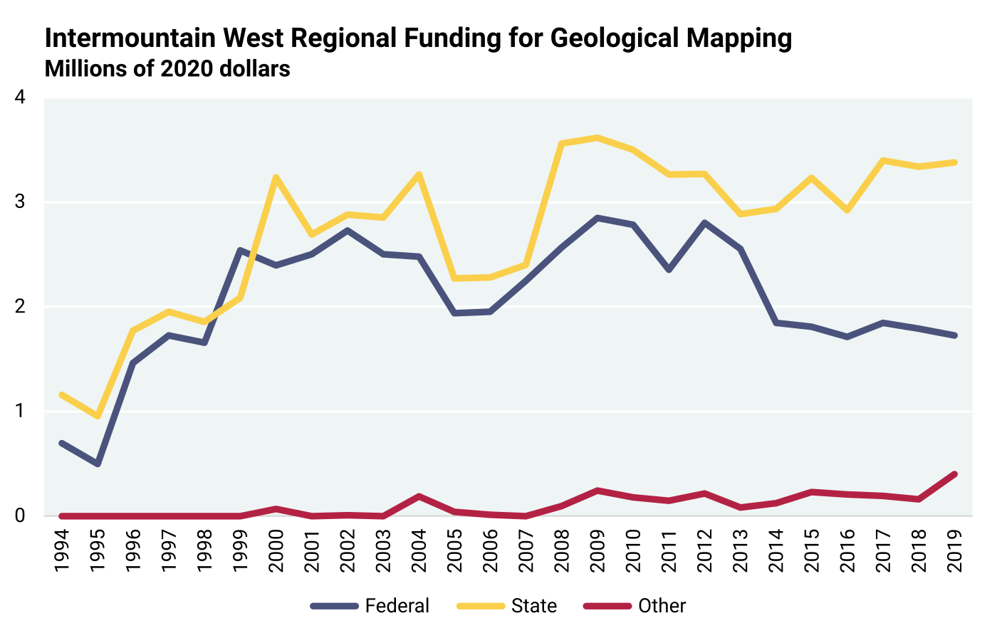
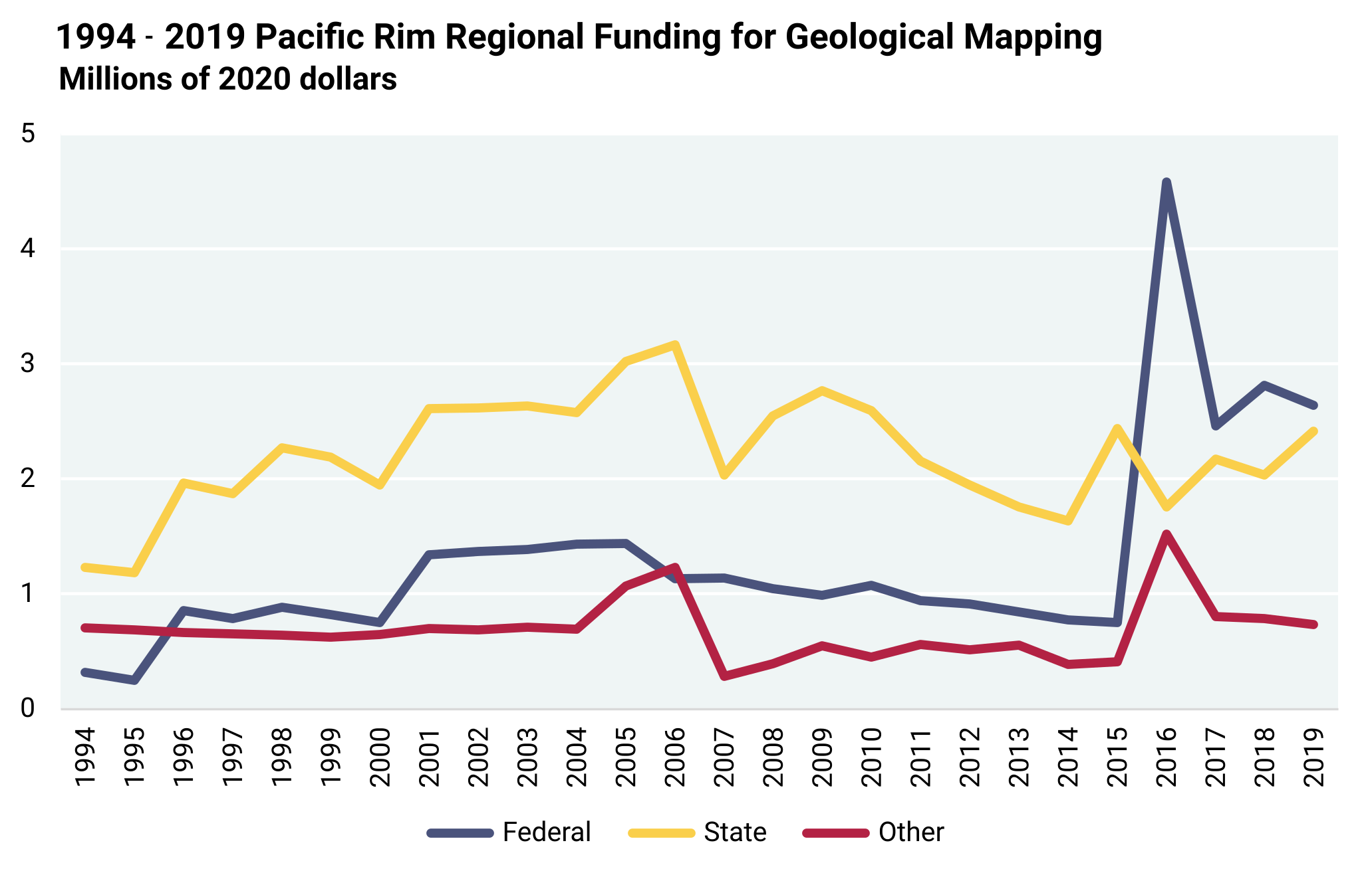
By regionalizing the states, this study identifies similar trends and differences with potential significant implications. Figures A7.13 through A7.24 in Appendix 7 were constructed to display the regional historical funding, based purely on the non-inflation adjusted data acquired in this study. The figures include line diagrams of the regional funding from the 1994 to 2019 period and clustered columns of total funding for geological mapping in each state within a region
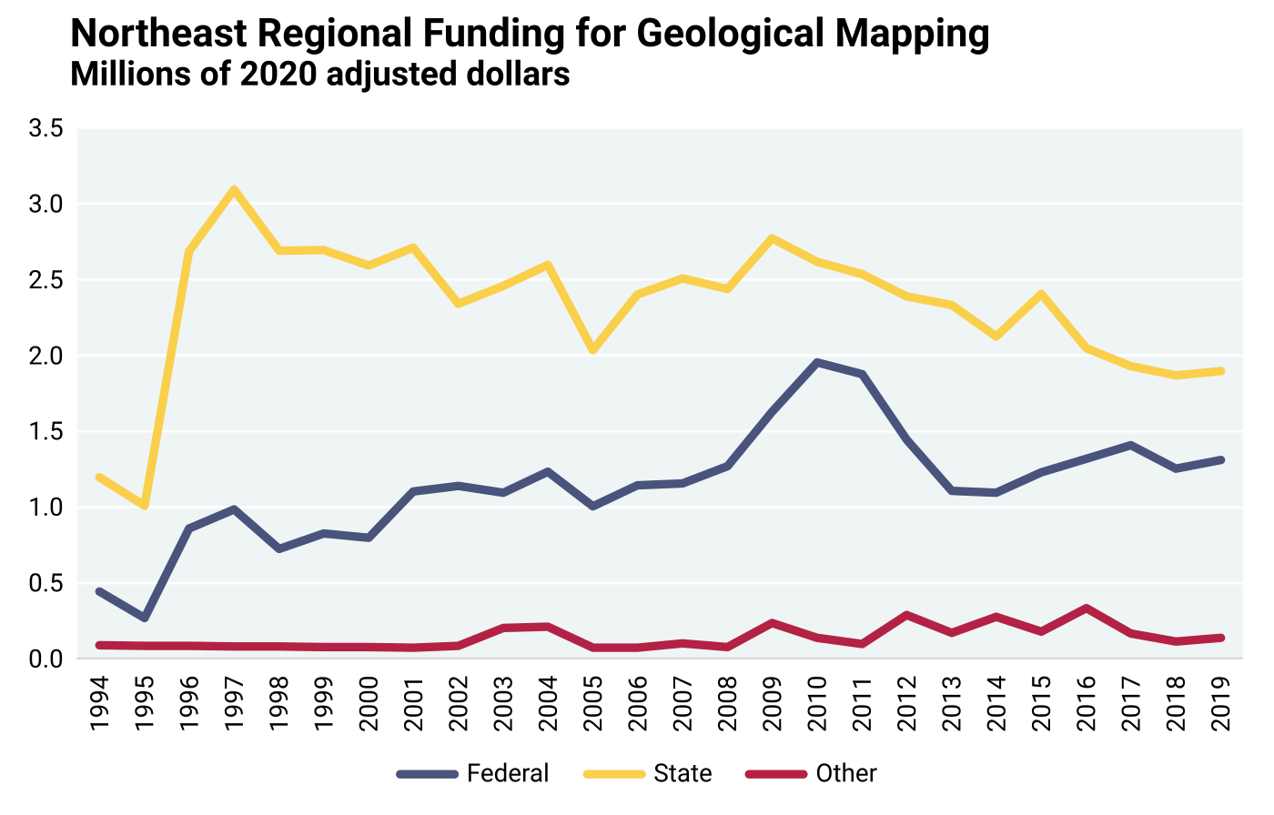
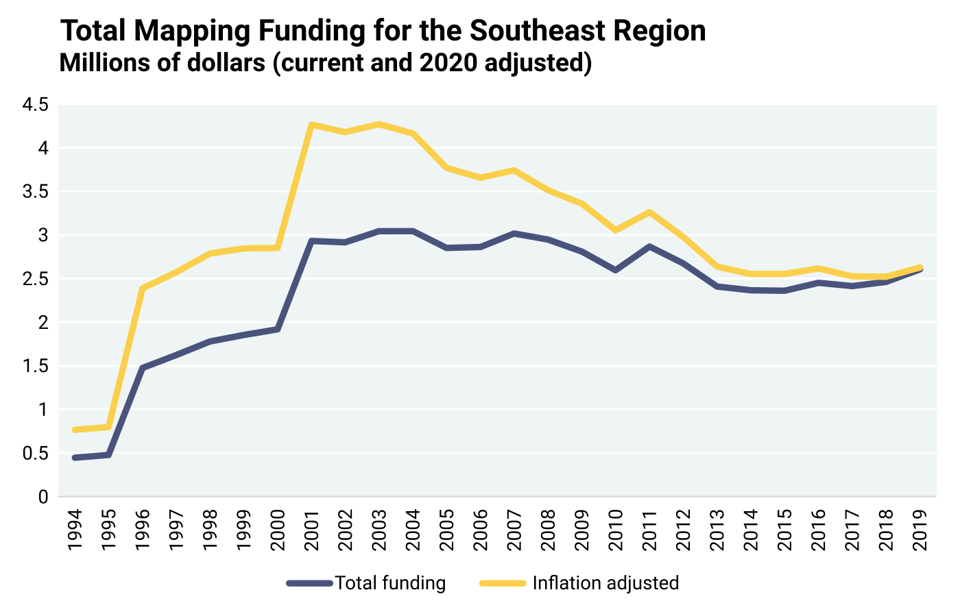
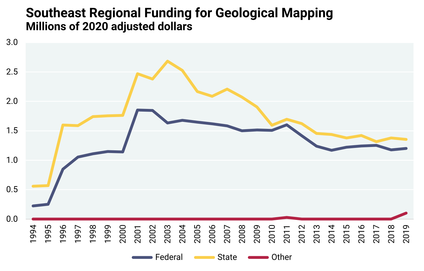
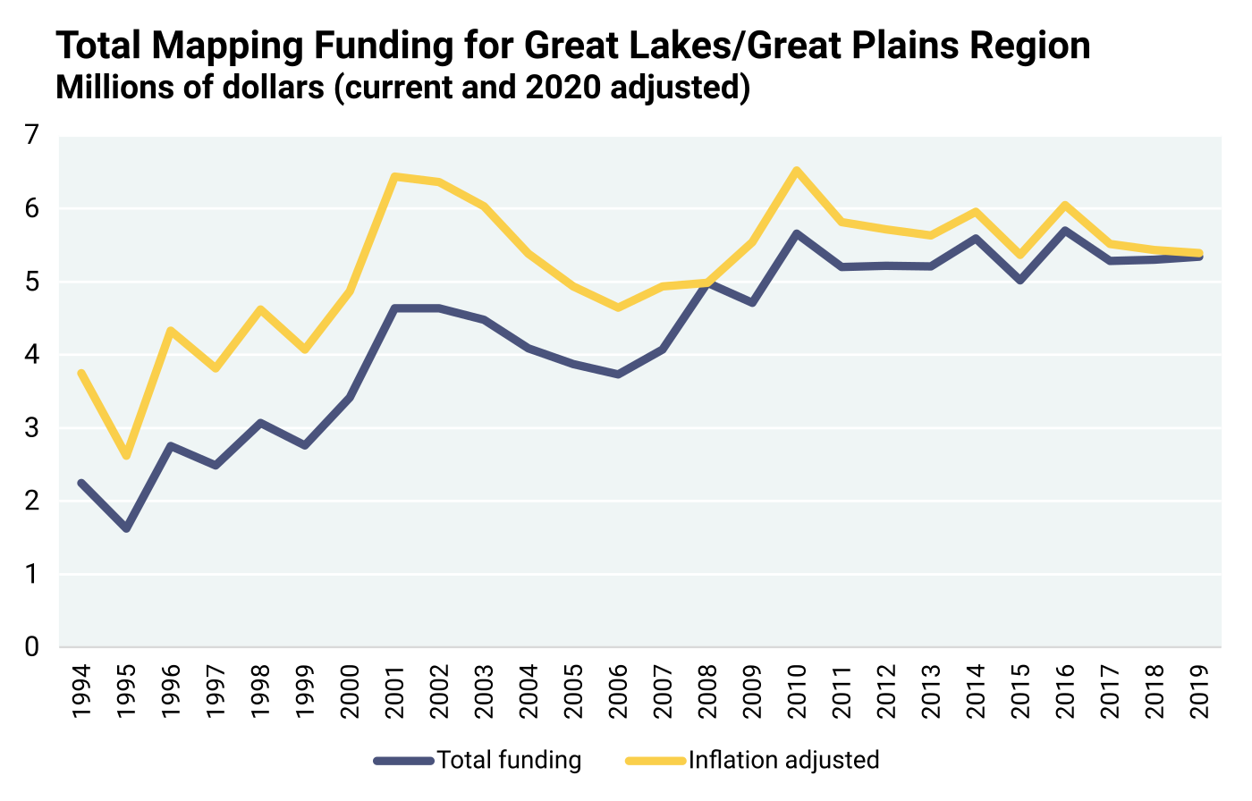
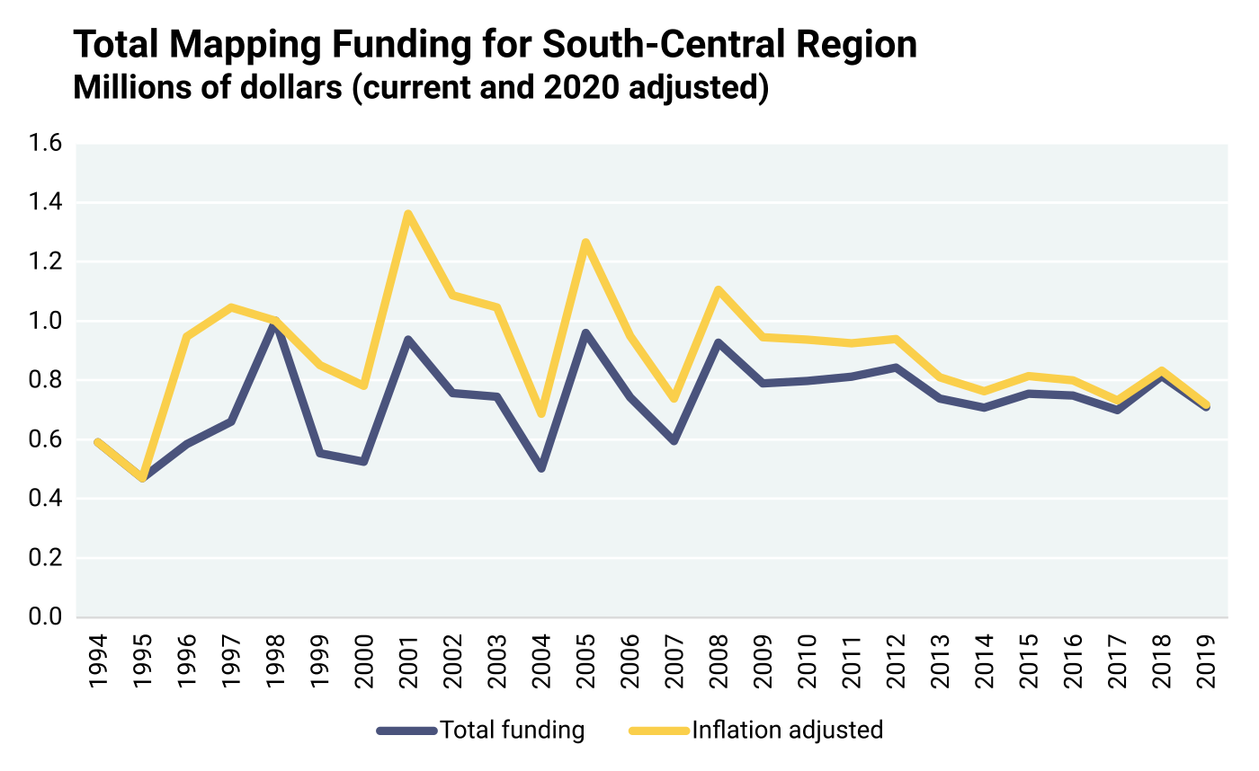
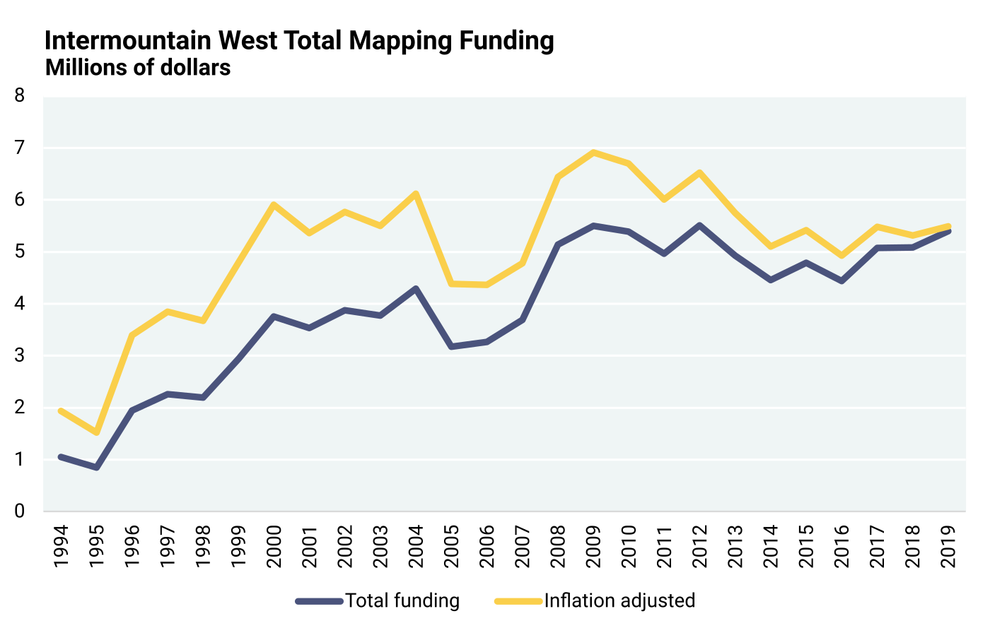
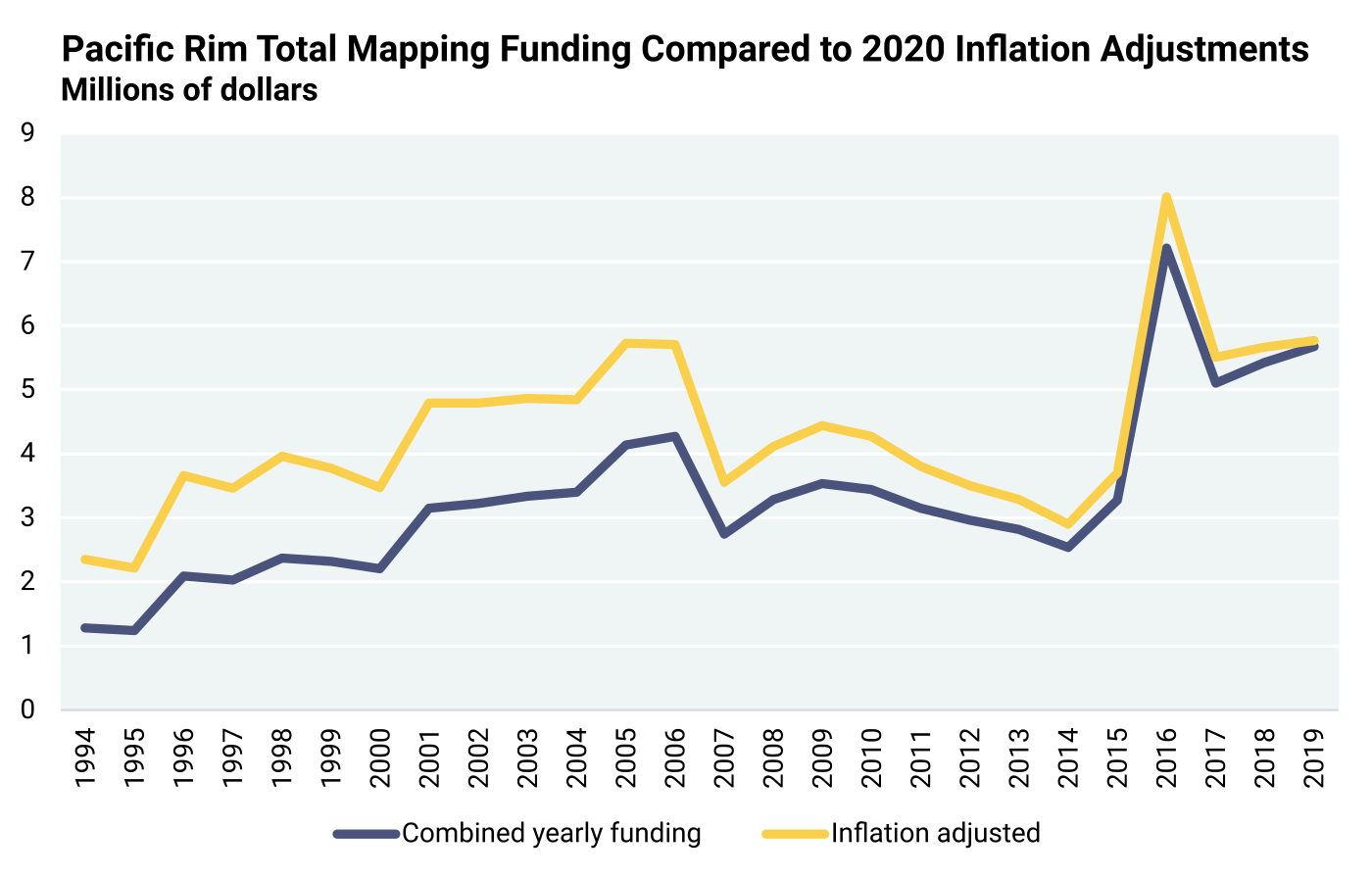
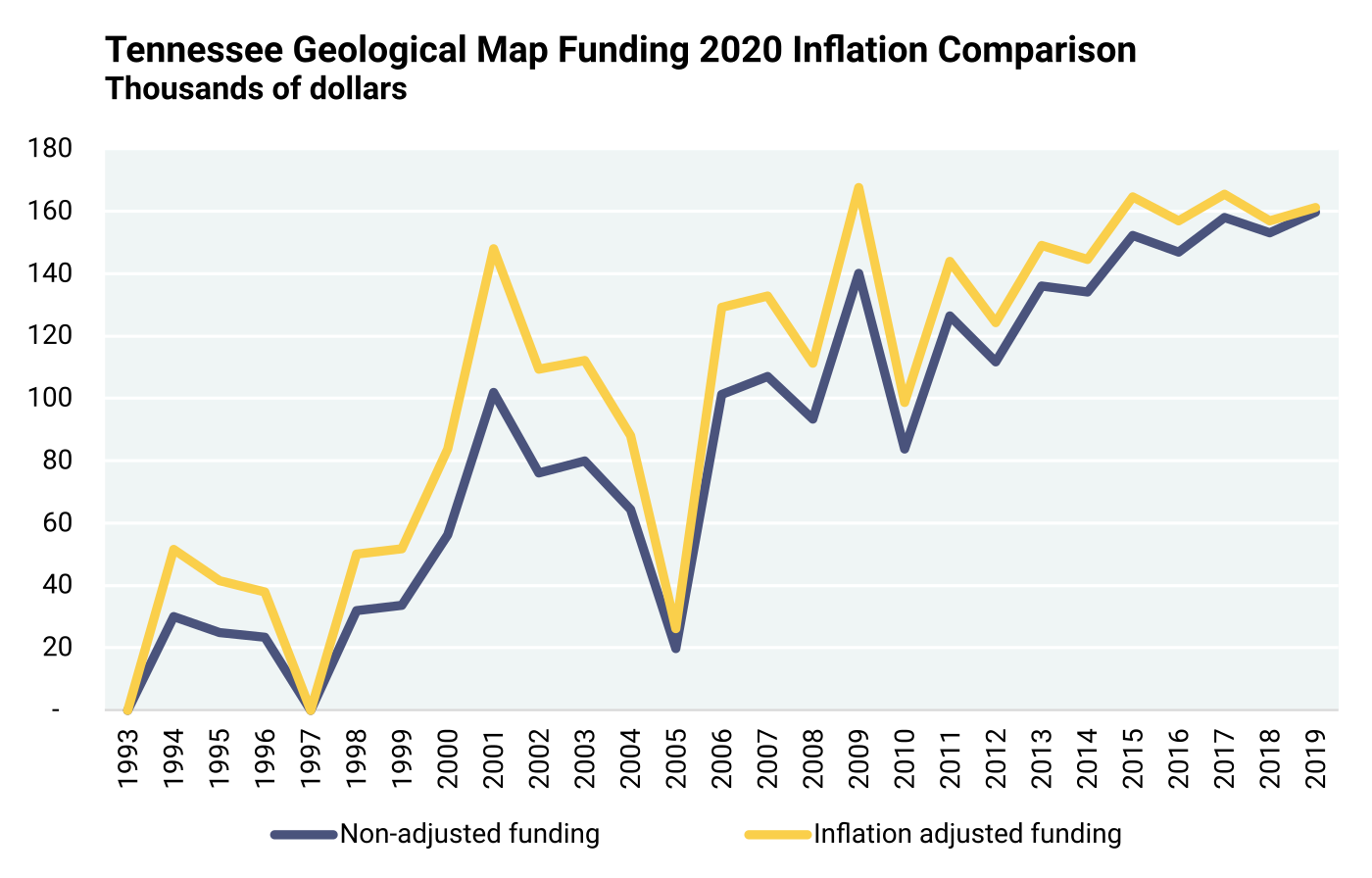
However, to address inflation over the 25-year period of data acquired for this study, the state cost data were adjusted to 2020 dollars, as illustrated in Figures 8.4.1 through 8.4.12 and discussed below under the heading “National CPI Inflation Adjustment to Historical Regional Data.” The cost data adjusted to 2020 dollars, based on 25 years of inflation, are used for the remainder of the analysis in this section.
The state cost data spreadsheets, however, do not have any information on the number of maps constructed during the 1994 to 2019 period. To contextualize the valuations of the state cost data, map information for specific state examples from each region was gathered through a separate inquiry, with assistance of representatives from the USGS National Geologic Map Database (NGMDB) and the NGMDB MapView interface, as discussed further in “Extraction of Map Estimates from the USGS National Geologic Map Database.”
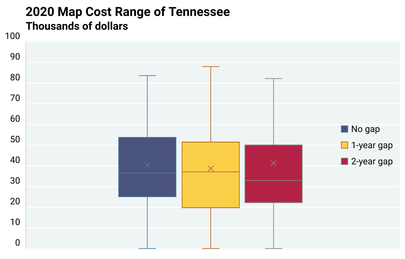
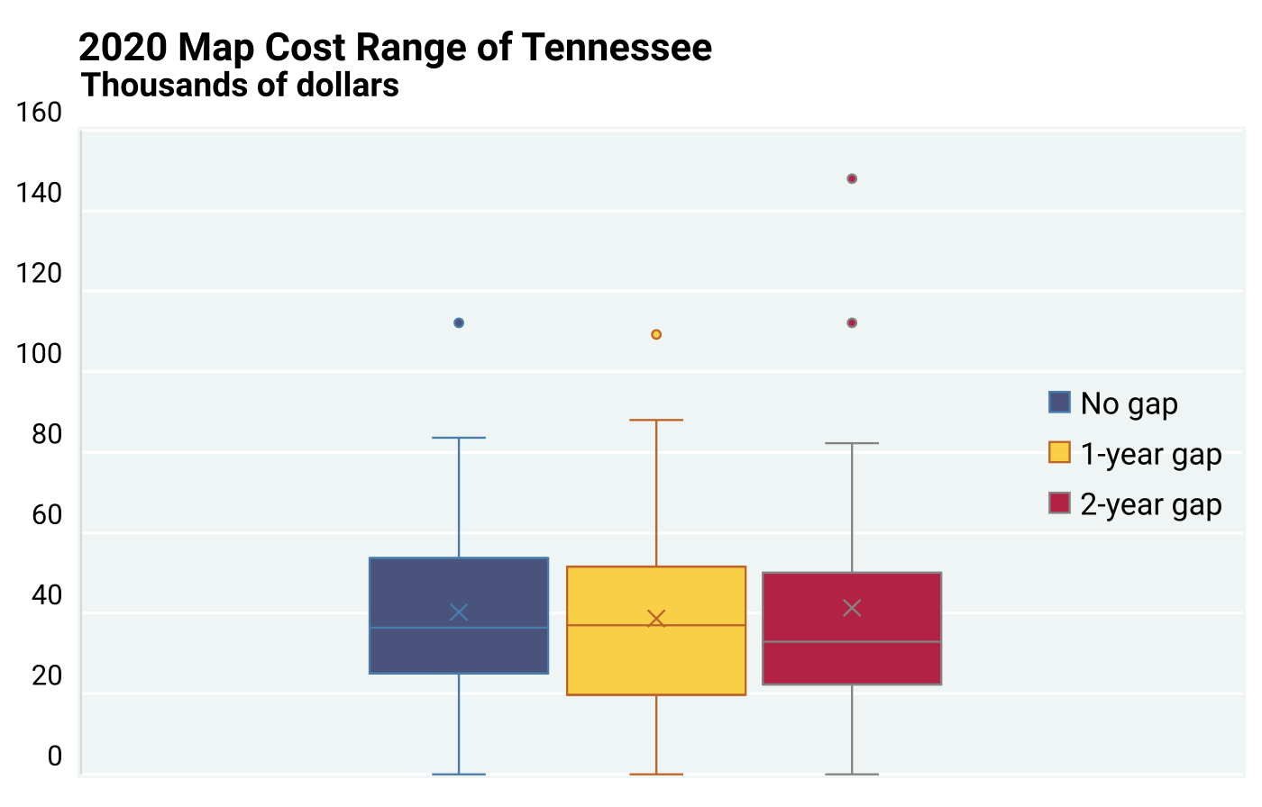
Box and whisker plots were then created to display estimated costs per map, based on the 2020 inflation adjusted state cost data and the map numbers gathered from the NGMDB MapView for the regional examples. The box and whisker plots were plotted with an (X) symbol representing the mean marker, a mean line, as well as outliers represented by dots with their independent estimated cost values. Along with the box and whisker plots, additional line graphs and clustered columns are referenced to specific state cost data, which are further discussed in the section “Six Regional Map Cost Examples Adjusted to 2020 Inflation Rate.” Figures 8.4.13 through 8.4.16 from Tennessee serve as examples of the projected map cost box, whisker plots, and the line graphs. The other five regions are included in Appendix 7 as Figures A7.25 through A7.44. The adjusted state cost data and estimated map costs for each regional example are displayed in Tables 8.4.1 through 8.4.6.
National CPI Inflation Adjustment to Historical Regional Data: To address the need to account for the value of the U.S. dollar over time, the 2020 national consumer price index (CPI) inflation adjustment that was used in previous Chapters was also applied to the regional analysis in this section. The Bureau of Labor Statistics (BLS) provides all the U.S. national CPI data online, which were used to determine the 2020 inflation adjustment. Figures 8.4.1 through 8.4.12, as well as Figures A7.25 through A7.44 in Appendix 7 are comparisons of historical funding with inflation adjusted funding for each of the six regions through line graphs, bar charts, and box and whisker plots.
Missing Information and Questions: The state expenditure Excel spreadsheet for geological mapping from SGS and the USGS is very significant; however, it leaves out important information about the number of maps produced. The SGS and the USGS did not provide any information on the number of geological maps published or produced each year throughout the 1994 to 2019 study period. The lack of such data raises two important questions:
Question 1: How many geological maps were constructed per year per region?
Question 2: What is the average cost of a geological map, based on regional data?
Although these two questions seem relatively simple, obtaining discrete answers was challenging. A solution to question 1 was addressed by gathering map information for regional examples, with assistance from NGMDB representatives of the USGS, using the NGMDB’s MapView interface. For a solution to question 2, the map data (number of maps) gathered using the NGMDB MapView interface were integrated with the state financial data to estimate the cost for producing geological maps. Estimated costs are displayed using box and whisker plots, line diagrams, and bar charts as shown on Figures 8.4.13 through 8.4.16 as well as A7.25 through A7.44 in Appendix 7. However, some assumptions had to be made, and the numerical estimates vary due to the range of data. Nonetheless, even considering that all SGS have not provided all their geological maps for inclusion in the NGMDB, a trend is apparent showing that an increase in the complexity of a geological map (or the finer the scale of a geological map) produced results in a higher production cost.
Extraction of Map Estimates from the USGS National Geologic Map Database: In 1992, the U.S. Government authorized the National Geologic Mapping Act, which created the National Cooperative Geologic Mapping Program (NCGMP), as described in Chapter 1. This program was created to fund geological mapping across the entire country and to address the construction of the NGMDB to serve as a national catalog and archive of geological maps and related information for the U.S. The USGS administers both the NCGMP and NGMDB in collaboration with SGS. The NGMDB Catalog contains citations for greater than 110,000 geoscience publications addressing a wide range of topics and themes, such as natural resources and geologic hazards. Because of the complex nature, format, and layout of geoscience publications, which are available from more than 600 publishers cataloged in the NGMDB, it is not straightforward to directly query the NGMDB Catalog to confidently identify all publications that contain geological maps. To address this concern, a related NGMDB resource was accessed, the “MapView” interface, which provides access to the subset of publications in the NGMDB Catalog that have been visually inspected and determined to include high-quality geological maps. As mentioned previously, the statistics presented herein for the number of geological maps published by each agency are, therefore, somewhat conservative.
Projections of Map Estimates to Provide Estimated Map Cost: After discussions with USGS NGMDB representatives, the following data were provided for this regional analysis. These data consist of the estimated number of maps for specific SGS examples within each of the six regions that were published within the 1994–2019 timespan. This is based on the conservative representation derived from the MapView interface. All of the financial data acquired for section 8.4 were through SGS and the USGS cost sheet datasets on the total funding provided for geological mapping, as discussed in Chapter 4 (see also Appendix 1). The simplest method of projecting the cost range of geological maps was by tallying the total funding of a region and dividing it by the estimated number of maps produced for each region, demonstrated below in Equation 8.4.1.
| Equation 8.4.1 Projected Map Cost = | Total Funding |
| Number of Maps |
Due to under-reporting of the number of geological maps, changes in funding per year, changes in funding sources, and differences between states (e.g., size, population, bedrock vs. surficial geology and its associated complexity), analyses of each SGS could not be addressed. In addition, the NGMDB is continuously updated with new geological maps replacing older versions across all regions of the U.S. Therefore, for each of the six regions of the U.S., one state with adequate completeness of data was selected to serve as a representative example for that region.
The completeness of the provided data from these regional state examples has allowed for independent estimates of projected map costs for each year between 1994 through 2019. One caveat that should be addressed is the delay between when an SGS was awarded funding from the federal government and the time for that map to be produced. For the SGS, the time between the funding award and the map production was generally between one to two years. For each regional example, the data are provided below, as well as three separate box and whisker plots. The examples consist of Maine for the Northeast region, Tennessee for the Southeast region, Illinois for the Great Lakes/Great Plains region, Arkansas for the South-Central region, Utah for the Intermountain West region, and Washington for the Pacific Rim region.
Tables 8.4.1 through 8.4.6 document funding received each year over the number of maps produced each year. Both a one-year and a two-year gap was recognized between the time that funding was awarded and when geological maps were produced. To compensate for the time gap, additional data were included: the 1993 awarded funding, and the number of maps published in 2020 and 2021. It should be mentioned that there is most likely an additional time gap between when the Federal Act began to when the funding was distributed for its purpose. The 2-year gap diagram likely provides the most accurate and realistic projection of map costs, though this is open to interpretation. In the box and whisker diagrams showing Tennessee as an example (Figures 8.4.15 and 8.4.16) and in Figures A7.27, A7.28, A7.31, A7.32 A7.35, A7.36, A7.39, A7.40, A7.43, and A7.44 in Appendix 7, the ‘X’ represents the median value, while the middle line of each box indicates the mean. All of the regional examples were adjusted to the 2020 national inflation rate. Lastly, it is important to also note that while certain map costs are categorized and graphed as outliers due to the cost extremities, specialized maps may have unusually high costs that are outside the norms.
With increasing prices of goods, products, and costs, as exemplified by the annual CPI, the costs of producing any geological map will also increase. However, funding provided for geological mapping by both federal and state governments has not always been able to meet the increasing inflation nor the growing needs for geological maps by the public and by private industries.
Northeast Regional Example
Table 8.4.1
Estimated map cost of Maine of the Northeast region of the U.S. These data include the total funding provided from the NCGMP for the state, the number of maps published each year, and three estimated map costs based on no gap, one‑year gap, and two-year gap between when the funds were awarded and the time a map was published. The total funding incorporates the 2020 national inflation adjustment.
| Projected Map Cost of Maine after Inflation Adjustment | |||||
| Funding Year | Adjusted Funding | Maps Published | No Gap | 1-Year Gap | 2-Year Gap |
| 1993 | $31,697.08 | No Data | $- | $31,697.08 | $31,697.08 |
| 1994 | $117,978.16 | 1 | $117,978.16 | $117,978.16 | $9,831.51 |
| 1995 | $150,353.89 | 1 | $150,353.89 | $12,529.49 | $10,023.59 |
| 1996 | $163,773.72 | 12 | $13,647.81 | $10,918.25 | $163,773.72 |
| 1997 | $81,420.72 | 15 | $5,428.05 | $81,420.72 | $2,714.02 |
| 1998 | $133,945.78 | 1 | $133,945.78 | $4,464.86 | $133,945.78 |
| 1999 | $164,872.51 | 30 | $5,495.75 | $164,872.51 | $41,218.13 |
| 2000 | $207,748.50 | 1 | $207,748.50 | $51,937.13 | $34,624.75 |
| 2001 | $213,032.03 | 4 | $53,258.01 | $35,505.34 | $16,387.08 |
| 2002 | $262,203.07 | 6 | $43,700.51 | $20,169.47 | $52,440.61 |
| 2003 | $294,328.27 | 13 | $22,640.64 | $58,865.65 | $98,109.42 |
| 2004 | $395,834.76 | 5 | $79,166.95 | $131,944.92 | $197,917.38 |
| 2005 | $209,030.30 | 3 | $69,676.77 | $104,515.15 | $23,225.59 |
| 2006 | $222,263.70 | 2 | $111,131.85 | $24,695.97 | $10,102.90 |
| 2007 | $333,981.93 | 9 | $37,109.10 | $15,181.00 | $25,690.92 |
| 2008 | $341,412.20 | 22 | $15,518.74 | $26,262.48 | $24,386.59 |
| 2009 | $346,618.07 | 13 | $26,662.93 | $24,758.43 | $21,663.63 |
| 2010 | $363,022.96 | 14 | $25,930.21 | $22,688.93 | $15,783.61 |
| 2011 | $326,264.82 | 16 | $20,391.55 | $14,185.43 | $29,660.44 |
| 2012 | $242,909.92 | 23 | $10,561.30 | $22,082.72 | $12,784.73 |
| 2013 | $358,587.81 | 11 | $32,598.89 | $18,873.04 | $39,843.09 |
| 2014 | $190,195.92 | 19 | $10,010.31 | $21,132.88 | $9,056.95 |
| 2015 | $237,950.42 | 9 | $26,438.94 | $11,330.97 | $59,487.60 |
| 2016 | $268,620.23 | 21 | $12,791.44 | $67,155.06 | $22,385.02 |
| 2017 | $282,953.61 | 4 | $70,738.40 | $23,579.47 | $31,439.29 |
| 2018 | $312,575.11 | 12 | $26,047.93 | $34,730.57 | $20,838.34 |
| 2019 | $358,222.75 | 9 | $39,802.53 | $23,881.52 | $51,174.68 |
| 2020 | No Data | 15 | No Data | ||
| 2021 | 7 | ||||
Southeast Regional Example
Table 8.4.2
Estimated map cost of Tennessee of the Southeast region of the U.S. These data include the total funding provided from the NCGMP for the state, the number of maps published each year, and three estimated map costs based on no gap, one‑year gap, and two-year gap between when the funds were awarded and the time a map was published. The markings of #DIV/0! only represent that a solution for the data cannot be divided by “zero.” The zero represents no maps being published that year. The total incorporated the 2020 national inflation adjustment.
| Projected Map Cost of Tennessee after Inflation Adjustment | |||||
| Funding Year | Adjusted Funding | Maps Published | No Gap | 1-Year Gap | 2-Year Gap |
| 1993 | $- | No Data | $- | $- | $- |
| 1994 | $51,549.21 | 1 | $51,549.21 | $51,549.21 | $17,183.07 |
| 1995 | $41,611.16 | 1 | $41,611.16 | $13,870.39 | $41,611.16 |
| 1996 | $37,839.75 | 3 | $12,613.25 | $37,839.75 | $18,919.87 |
| 1997 | $- | 1 | $- | $- | #DIV/0! |
| 1998 | $50,072.05 | 2 | $25,036.02 | #DIV/0! | $50,072.05 |
| 1999 | $51,766.03 | 0 | #DIV/0! | $51,766.03 | $25,883.01 |
| 2000 | $83,674.76 | 1 | $83,674.76 | $41,837.38 | $27,891.59 |
| 2001 | $148,015.04 | 2 | $74,007.52 | $49,338.35 | $148,015.04 |
| 2002 | $109,326.55 | 3 | $36,442.18 | $109,326.55 | $54,663.28 |
| 2003 | $112,189.06 | 1 | $112,189.06 | $56,094.53 | $112,189.06 |
| 2004 | $88,038.45 | 2 | $44,019.22 | $88,038.45 | $44,019.22 |
| 2005 | $26,134.16 | 1 | $26,134.16 | $13,067.08 | $6,533.54 |
| 2006 | $129,266.74 | 2 | $64,633.37 | $32,316.68 | $32,316.68 |
| 2007 | $132,757.37 | 4 | $33,189.34 | $33,189.34 | $44,252.46 |
| 2008 | $111,212.64 | 4 | $27,803.16 | $37,070.88 | $22,242.53 |
| 2009 | $167,533.00 | 3 | $55,844.33 | $33,506.60 | $33,506.60 |
| 2010 | $98,635.34 | 5 | $19,727.07 | $19,727.07 | $32,878.45 |
| 2011 | $143,857.55 | 5 | $28,771.51 | $47,952.52 | $20,551.08 |
| 2012 | $124,380.76 | 3 | $41,460.25 | $17,768.68 | $41,460.25 |
| 2013 | $149,156.42 | 7 | $21,308.06 | $49,718.81 | $29,831.28 |
| 2014 | $144,674.18 | 3 | $48,224.73 | $28,934.84 | $36,168.55 |
| 2015 | $164,595.44 | 5 | $32,919.09 | $41,148.86 | $82,297.72 |
| 2016 | $156,978.13 | 4 | $39,244.53 | $78,489.07 | $31,395.63 |
| 2017 | $165,512.22 | 2 | $82,756.11 | $33,102.44 | $55,170.74 |
| 2018 | $156,873.75 | 5 | $31,374.75 | $52,291.25 | $26,145.62 |
| 2019 | $161,326.34 | 3 | $53,775.45 | $26,887.72 | $80,663.17 |
| 2020 | No Data | 6 | No Data | ||
| 2021 | 2 | ||||
Great Lakes/Great Plains Regional Example
Table 8.4.3
Estimated map cost of Illinois of the Great Lakes/Great Plains region of the U.S. These data include the total funding provided from the NCGMP for the state, the number of maps published each year, and three estimated map costs based on no gap, one-year gap, and two-year gap between when the funds were awarded and the time a map was published. The total funding incorporates the 2020 national inflation adjustment.
| Projected Map Cost of Illinois After Inflation | |||||
| Funding Year | Adjusted Funding | Maps Published | No Gap | 1-Year Gap | 2-Year Gap |
| 1993 | $567,109.93 | No Data | $- | $283,554.97 | $283,554.97 |
| 1994 | $535,037.49 | 2 | $267,518.75 | $267,518.75 | $267,518.75 |
| 1995 | $320,946.74 | 2 | $160,473.37 | $160,473.37 | $53,491.12 |
| 1996 | $581,679.68 | 2 | $290,839.84 | $96,946.61 | $290,839.84 |
| 1997 | $490,190.17 | 6 | $81,698.36 | $245,095.09 | $81,698.36 |
| 1998 | $1,209,295.30 | 2 | $604,647.65 | $201,549.22 | $172,756.47 |
| 1999 | $432,812.63 | 6 | $72,135.44 | $61,830.38 | $61,830.38 |
| 2000 | $626,671.27 | 7 | $89,524.47 | $89,524.47 | $56,970.12 |
| 2001 | $681,710.82 | 7 | $97,387.26 | $61,973.71 | $227,236.94 |
| 2002 | $772,930.17 | 11 | $70,266.38 | $257,643.39 | $51,528.68 |
| 2003 | $905,039.65 | 3 | $301,679.88 | $60,335.98 | $56,564.98 |
| 2004 | $971,218.14 | 15 | $64,747.88 | $60,701.13 | $194,243.63 |
| 2005 | $928,181.42 | 16 | $58,011.34 | $185,636.28 | $37,127.26 |
| 2006 | $970,676.99 | 5 | $194,135.40 | $38,827.08 | $60,667.31 |
| 2007 | $883,129.55 | 25 | $35,325.18 | $55,195.60 | $88,312.96 |
| 2008 | $756,598.99 | 16 | $47,287.44 | $75,659.90 | $42,033.28 |
| 2009 | $803,565.38 | 10 | $80,356.54 | $44,642.52 | $100,445.67 |
| 2010 | $834,932.98 | 18 | $46,385.17 | $104,366.62 | $75,903.00 |
| 2011 | $695,167.32 | 8 | $86,895.92 | $63,197.03 | $53,474.41 |
| 2012 | $550,519.85 | 11 | $50,047.26 | $42,347.68 | $68,814.98 |
| 2013 | $712,278.21 | 13 | $54,790.63 | $89,034.78 | $89,034.78 |
| 2014 | $673,761.43 | 8 | $84,220.18 | $84,220.18 | $112,293.57 |
| 2015 | $577,015.65 | 8 | $72,126.96 | $96,169.27 | $72,126.96 |
| 2016 | $592,260.43 | 6 | $98,710.07 | $74,032.55 | $84,608.63 |
| 2017 | $691,577.17 | 8 | $86,447.15 | $98,796.74 | $76,841.91 |
| 2018 | $579,857.09 | 7 | $82,836.73 | $64,428.57 | $72,482.14 |
| 2019 | $650,488.25 | 9 | $72,276.47 | $81,311.03 | #DIV/0! |
| 2020 | No Data | 8 | No Data | ||
| 2021 | 0 | ||||
South-Central Regional Example
Table 8.4.4
Estimated map cost of Arkansas of the South-Central region of the U.S. These data include the total funding provided from the NCGMP for the state, the number of maps published each year, and three estimated map costs based on no gap, one-year gap, and two-year gap between when the funds were awarded and the time a map was published. The markings of #DIV/0! only represent that a solution for the data cannot be divided by “zero.” The zero represents no maps published that year. The total funding incorporated the 2020 national inflation adjustment.
| Projected Map Cost of Arkansas After Inflation | |||||
| Funding Year | Adjusted Funding | Maps Published | No Gap | 1-Year Gap | 2-Year Gap |
| 1993 | $- | No Data | $- | $- | $- |
| 1994 | $- | 6 | $- | $- | #DIV/0! |
| 1995 | $98,432.68 | 2 | $49,216.34 | #DIV/0! | $24,608.17 |
| 1996 | $37,290.99 | 0 | #DIV/0! | $9,322.75 | $7,458.20 |
| 1997 | $134,097.08 | 4 | $33,524.27 | $26,819.42 | $22,349.51 |
| 1998 | $127,862.10 | 5 | $25,572.42 | $21,310.35 | $11,623.83 |
| 1999 | $117,624.66 | 6 | $19,604.11 | $10,693.15 | $10,693.15 |
| 2000 | $119,563.83 | 11 | $10,869.44 | $10,869.44 | $13,284.87 |
| 2001 | $133,422.22 | 11 | $12,129.29 | $14,824.69 | $10,263.25 |
| 2002 | $147,425.85 | 9 | $16,380.65 | $11,340.45 | $14,742.59 |
| 2003 | $138,308.07 | 13 | $10,639.08 | $13,830.81 | $34,577.02 |
| 2004 | $175,436.83 | 10 | $17,543.68 | $43,859.21 | $12,531.20 |
| 2005 | $167,056.89 | 4 | $41,764.22 | $11,932.63 | $7,593.49 |
| 2006 | $222,492.96 | 14 | $15,892.35 | $10,113.32 | $13,905.81 |
| 2007 | $182,298.78 | 22 | $8,286.31 | $11,393.67 | $20,255.42 |
| 2008 | $249,506.40 | 16 | $15,594.15 | $27,722.93 | $62,376.60 |
| 2009 | $155,137.24 | 9 | $17,237.47 | $38,784.31 | $25,856.21 |
| 2010 | $161,695.70 | 4 | $40,423.93 | $26,949.28 | $40,423.93 |
| 2011 | $166,316.24 | 6 | $27,719.37 | $41,579.06 | $83,158.12 |
| 2012 | $152,961.07 | 4 | $38,240.27 | $76,480.53 | $76,480.53 |
| 2013 | $134,152.83 | 2 | $67,076.41 | $67,076.41 | $44,717.61 |
| 2014 | $158,127.86 | 2 | $79,063.93 | $52,709.29 | $158,127.86 |
| 2015 | $124,142.86 | 3 | $41,380.95 | $124,142.86 | $62,071.43 |
| 2016 | $125,081.36 | 1 | $125,081.36 | $62,540.68 | $62,540.68 |
| 2017 | $149,641.40 | 2 | $74,820.70 | $74,820.70 | $74,820.70 |
| 2018 | $146,471.83 | 2 | $73,235.92 | $73,235.92 | $146,471.83 |
| 2019 | $132,523.33 | 2 | $66,261.66 | $132,523.33 | $132,523.33 |
| 2020 | No Data | 1 | No Data | ||
| 2021 | 1 | ||||
Intermountain West Regional Example
Table 8.4.5
Estimated map cost of Utah of the Intermountain West region of the U.S. These data include the total funding provided from the NCGMP for the state, the number of maps published each year, and three estimated map costs based on no gap, one-year gap, and two-year gap between when the funds were awarded and the time a map was published. The total funding incorporates the 2020 national inflation adjustment.
| Projected Map Cost of Utah After Inflation | |||||
| Funding Year | Adjusted Funding | Maps Published | No Gap | 1-Year Gap | 2-Year Gap |
| 1993 | $112,882.49 | No Data | $- | $4,907.93 | $10,262.04 |
| 1994 | $507,171.11 | 23 | $22,050.92 | $46,106.46 | $56,352.35 |
| 1995 | $471,819.41 | 11 | $42,892.67 | $52,424.38 | $21,446.34 |
| 1996 | $744,956.90 | 9 | $82,772.99 | $33,861.68 | $372,478.45 |
| 1997 | $904,328.63 | 22 | $41,105.85 | $452,164.32 | $113,041.08 |
| 1998 | $907,171.70 | 2 | $453,585.85 | $113,396.46 | $100,796.86 |
| 1999 | $875,943.36 | 8 | $109,492.92 | $97,327.04 | $87,594.34 |
| 2000 | $788,172.31 | 9 | $87,574.70 | $78,817.23 | $34,268.36 |
| 2001 | $879,121.97 | 10 | $87,912.20 | $38,222.69 | $73,260.16 |
| 2002 | $1,024,804.53 | 23 | $44,556.72 | $85,400.38 | $64,050.28 |
| 2003 | $1,190,805.15 | 12 | $99,233.76 | $74,425.32 | $74,425.32 |
| 2004 | $1,108,309.80 | 16 | $69,269.36 | $69,269.36 | $79,164.99 |
| 2005 | $961,883.07 | 16 | $60,117.69 | $68,705.93 | $50,625.42 |
| 2006 | $884,885.03 | 14 | $63,206.07 | $46,572.90 | $46,572.90 |
| 2007 | $962,882.50 | 19 | $50,678.03 | $50,678.03 | $43,767.39 |
| 2008 | $951,300.97 | 19 | $50,068.47 | $43,240.95 | $52,850.05 |
| 2009 | $1,082,128.59 | 22 | $49,187.66 | $60,118.26 | $135,266.07 |
| 2010 | $1,057,214.82 | 18 | $58,734.16 | $132,151.85 | $81,324.22 |
| 2011 | $1,250,286.54 | 8 | $156,285.82 | $96,175.89 | $73,546.27 |
| 2012 | $1,756,779.62 | 13 | $135,136.89 | $103,339.98 | $195,197.74 |
| 2013 | $1,557,477.20 | 17 | $91,616.31 | $173,053.02 | $155,747.72 |
| 2014 | $1,368,284.32 | 9 | $152,031.59 | $136,828.43 | $105,252.64 |
| 2015 | $1,485,669.85 | 10 | $148,566.99 | $114,282.30 | $135,060.90 |
| 2016 | $1,423,378.45 | 13 | $109,490.65 | $129,398.04 | $79,076.58 |
| 2017 | $1,401,808.17 | 11 | $127,437.11 | $77,878.23 | $82,459.30 |
| 2018 | $1,654,499.35 | 18 | $91,916.63 | $97,323.49 | $330,899.87 |
| 2019 | $1,398,770.02 | 17 | $82,280.59 | $279,754.00 | $233,128.34 |
| 2020 | No Data | 5 | No Data | ||
| 2021 | 6 | ||||
Pacific Rim Regional Example
Table 8.4.6
Estimated map cost of Washington of the Pacific Rim region of the U.S. These data include the total funding provided from the NCGMP for the state, the number of maps published each year, and three estimated map costs based on no gap, one-year gap, and two-year gap between when the funds were awarded and the time a map was published. The markings of #DIV/0! only represent that a solution for the data cannot be divided by “zero.” The zero represents no maps published that year. The total incorporated the 2020 national inflation adjustment.
| Projected Map Cost of Washington After Inflation | |||||
| Funding Year | Adjusted Funding | Maps Published | No Gap | 1-Year Gap | 2-Year Gap |
| 1993 | $94,068.74 | No Data | $- | $13,438.39 | $94,068.74 |
| 1994 | $110,316.98 | 7 | $15,759.57 | $110,316.98 | $55,158.49 |
| 1995 | $107,514.14 | 1 | $107,514.14 | $53,757.07 | $21,502.83 |
| 1996 | $420,585.89 | 2 | $210,292.94 | $84,117.18 | $140,195.30 |
| 1997 | $492,000.97 | 5 | $98,400.19 | $164,000.32 | $123,000.24 |
| 1998 | $481,343.06 | 3 | $160,447.69 | $120,335.76 | $120,335.76 |
| 1999 | $458,890.83 | 4 | $114,722.71 | $114,722.71 | #DIV/0! |
| 2000 | $396,676.88 | 4 | $99,169.22 | #DIV/0! | $79,335.38 |
| 2001 | $394,099.61 | 0 | #DIV/0! | $78,819.92 | $24,631.23 |
| 2002 | $509,032.67 | 5 | $101,806.53 | $31,814.54 | $50,903.27 |
| 2003 | $636,761.33 | 16 | $39,797.58 | $63,676.13 | $70,751.26 |
| 2004 | $784,625.03 | 10 | $78,462.50 | $87,180.56 | $196,156.26 |
| 2005 | $797,153.63 | 9 | $88,572.63 | $199,288.41 | $265,717.88 |
| 2006 | $595,019.03 | 4 | $148,754.76 | $198,339.68 | #DIV/0! |
| 2007 | $591,392.64 | 3 | $197,130.88 | #DIV/0! | $49,282.72 |
| 2008 | $545,305.27 | 0 | #DIV/0! | $45,442.11 | $136,326.32 |
| 2009 | $536,339.91 | 12 | $44,694.99 | $134,084.98 | $268,169.95 |
| 2010 | $568,671.39 | 4 | $142,167.85 | $284,335.70 | $113,734.28 |
| 2011 | $583,179.85 | 2 | $291,589.92 | $116,635.97 | $194,393.28 |
| 2012 | $504,566.30 | 5 | $100,913.26 | $168,188.77 | $126,141.57 |
| 2013 | $526,517.26 | 3 | $175,505.75 | $131,629.31 | $175,505.75 |
| 2014 | $415,133.80 | 4 | $103,783.45 | $138,377.93 | $138,377.93 |
| 2015 | $400,281.70 | 3 | $133,427.23 | $133,427.23 | $200,140.85 |
| 2016 | $406,577.94 | 3 | $135,525.98 | $203,288.97 | $203,288.97 |
| 2017 | $502,541.74 | 2 | $251,270.87 | $251,270.87 | $251,270.87 |
| 2018 | $502,897.43 | 2 | $251,448.71 | $251,448.71 | $125,724.36 |
| 2019 | $757,454.17 | 2 | $378,727.09 | $189,363.54 | $189,363.54 |
| 2020 | No Data | 4 | No Data | ||
| 2021 | 4 | ||||
Note Regarding Separate USGS Cost Spreadsheet: The USGS also provided funding levels for geological mapping conducted by the FEDMAP component of NCGMP from 1994–2019. However, this regional analysis was limited to just the SGS data due to the difficulty of regionalizing maps produced by the USGS, which commonly maps across state boundaries and does not separate costs based on individual states. Therefore, there is no justification to apply USGS data to the state regional mapping estimates.
Summary of Results: Four tables are displayed below that summarize the results from this regional analysis. Table 8.4.7 is a comparison of examples from the representative state of each region for the highest and lowest year of funding to the funding awarded in 2019. First, it is important to note that only two regional examples, Tennessee (Southeast) and Utah (Intermountain West), received their highest funding awards within the 3-years (2017–2019) immediately prior to 2020. For the remaining four regional examples, the highest funding award dates occurred between the years 1998 and 2008, 12+ years prior to 2020. Tennessee had the most consistent increase of funding awards since the 1993 to 1997 period, when they received no awards for geological mapping (Table 8.4.2). Utah had the second most consistent funding since 1993, when the state also did not receive any awards for geological mapping. Table 8.4.8 shows the difference between the peak awards of representative states from each region to the 2019 award. Table 8.4.9 is a comparison of the highest and lowest number of geological maps published and the corresponding year from representative states from each region. Finally, Table 8.4.10 portrays the estimated average cost for producing a geological map in 2020 for each regional state example. Each table is followed by a short review that explains the summarized findings.
As a reminder, the NGMA and NCGMP of 1992 were not implemented until 1993. Numerous SGS may not have had the ability to meet the requirements of the act (e.g., 1:1 match with state funds) at that time to receive a funding award. Table 8.4.7 shows that the SGS with the highest yearly combined awards received from state and federal sources within the regional examples are Utah (Intermountain West) at $1,645,991.24 (2018) and Illinois (Great Lakes/Great Plains) at $1,285,042.31 (1998). While Utah had a relatively consistent increase of funding awards since 1993, Illinois had a large decrease of funding since 1998. The states with the lowest total funding awards from the regional examples are Tennessee (Southeast) and Arkansas (South-Central). Neither of these two regional examples received any funding award during the initial year of the NCGMP (1993), and Arkansas also received no funding in 1994 (Table 8.4.4). The total funding awards received for both Tennessee and Arkansas represent only a fraction of the overall funding received by the remaining regional examples.
Table 8.4.7
Comparison of the highest, lowest, and 2019 funding awarded for geological mapping between 1993 and 2019. The state cost data are from the state mapping expenditures Excel spreadsheets filled out by SGS and incorporated the 2020 inflation adjustment.
| Regional Example: Comparison of Funding for Geological Mapping Awarded from 1993 to 2019 | ||||||
|---|---|---|---|---|---|---|
| Region | State | 2019 Funding | Highest year | Highest Funding | Lowest Year | Lowest Funding |
| Northeast | Maine | $360,586.25 | 2004 | $402,672.29 | 1993 | $31,965.50 |
| Southeast | Tennessee | $163,097.95 | 2017 | $168,322.11 | 1993/1997 | $- |
| Great Lakes/Great Plains | Illinois | $657,708.77 | 1998 | $1,285,042.31 | 1995 | $339,812.07 |
| South-Central | Arkansas | $133,978.64 | 2008 | $253,858.56 | 1994 | $- |
| Intermountain West | Utah | $1,403,329.86 | 2018 | $1,645,991.24 | 1993 | $109,596.00 |
| Pacific Rim | Washington | $759,923.39 | 2005 | $770,357.60 | 1993 | $91,330.00 |
Table 8.4.8 compares the highest funding award to the funding awarded in 2019 for the representative SGS from each region. The table also includes the percentage of change between the funding of the two awards and the net dollar difference. For each regional example, there was a negative differential between the funding awards and highest funding awards received in 2019. The last column, highlighted in red, lists the net difference in the dollars between the highest funding award and the 2019 award. A negative net difference represents a decrease in funding.
Table 8.4.8
Comparison of the highest, lowest, and 2019 funding awarded for geological mapping between 1993 and 2019. The state cost data are from the state mapping expenditures Excel spreadsheets filled out by SGS and incorporating the 2020 inflation adjustment.
| Regional Example: Difference of Peak Funding Year to 2019 Funding | |||||
| Region | State | Peak Funding | 2019 Funding | % Difference | Net Difference |
| Northeast | Maine | $402,672.29 | $360,586.25 | -11.7% | $(42,086.04) |
| Southeast | Tennessee | $168,322.11 | $163,097.95 | -3.2% | $(5,224.16) |
| Great Lakes/Great Plains | Illinois | $1,285,042.31 | $657,708.77 | -95.4% | $(627,333.54) |
| South-Central | Arkansas | $253,858.56 | $133,978.64 | -89.5% | $(119,879.92) |
| Intermountain West | Utah | $1,645,991.24 | $1,403,329.86 | -17.3% | $(242,661.38) |
| Pacific Rim | Washington | $770,357.60 | $759,923.39 | -1.4% | $(10,434.21) |
Table 8.4.9 compares the years with the highest and lowest publishing of geological maps for the representative SGS in each region. The table also includes the estimated number of maps produced for the corresponding publication year. It is expected that the geological maps will be published 1-to-2 years after a SGS receives the funding award for production of the maps. However, this expectation is not absolute. The number of maps produced may fluctuate based on available resources, accessibility, technical requirements, unanticipated geological complexity, funding still available, number of employees, and any special requests or events (e.g., natural disaster) to meet public needs in each state.
Table 8.4.9
Comparison of the highest, lowest, and 2019 funding awarded for geological mapping between 1993 and 2019. The state cost data are from the state mapping expenditures Excel spreadsheets filled out by SGS and incorporated the 2020 inflation adjustment.
| Regional Example: Highest and Lowest Map Production Year Within 1994–2021 | |||||
| Region | State | Highest Map Year | # of Maps | Lowest Map Year | # of Maps |
| Northeast | Maine | 1999 | 30 | 1994/1995/2000 | 1 |
| Southeast | Tennessee | 2013 | 7 | 1999 | 0 |
| Great Lakes/Great Plains | Illinois | 2007 | 25 | 2021 | 0 |
| South-Central | Arkansas | 2007 | 22 | 1996 | 0 |
| Intermountain West | Utah | 1994 | 23 | 1998 | 2 |
| Pacific Rim | Washington | 2003 | 16 | 2001/2008 | 0 |
*Note: To project a two-year gap between the year the funding is awarded and the year the map is completed, additional data for maps was needed for 2020 and 2021.
The information in Table 8.4.10 is the projected average cost for producing a geological map for each regional example. The average costs are derived from the box and whisker plots of the projected map costs. The time lag between when a SGS receives a funding award and when the corresponding maps are completed typically range between 1 to 2 years. The three columns in the table list the average costs for producing a map, arranged by no time gap, a 1-year gap, and a 2-year gap.
Table 8.4.10
The projected average cost for producing a geological map in 2020 for the six regional state examples. These examples are used as the basis of the overall region (e.g., access to commonalities and both geographical and geological similarities/differences, regarding geological map making).
Regional Example: 2020 Projected Average Cost for Geological Map Making
| Region | State | No Gap | 1-Year Gap | 2-Year Gap |
|---|---|---|---|---|
| Northeast | Maine | $51,102.53 | $44,005.69 | $44,502.14 |
| Southeast | Tennessee | $40,987.84 | $39,348.23 | $42,013.96 |
| Great Lakes/Great Plains | Illinois | $131,234.06 | $118,355.65 | $110,144.86 |
| South-Central | Arkansas | $36,322.00 | $98,902.93 | $44,231.98 |
| Intermountain West | Utah | $95,508.26 | $98,902.93 | $103,810.22 |
| Pacific Rim | Washington | $129,713.14 | $121,048.40 | $122,654.97 |
Discussion: It is important to note that the diagrams in Figures A7.25 to A7.44 in Appendix 7, and the summation of results in Tables 8.4.7 to 8.4.10, are projections of the range of costs affiliated with geological map making. All estimations and projections were derived from the data provided by SGS on their individual cost spreadsheets (Appendix 1).
There are multiple caveats and assumptions made that could affect the validity of these estimated values. Even so, these results display the high variation in potential costs of geological maps as illustrated best in the box and whisker diagrams. As the scale changes and the complexity of a map increases, the cost also increases. Federal and state government-funded maps can only be seen as a public good due to the complexity and high costs associated with them. Most private entities will not produce or release geological maps anywhere close to the extent of SGS and the USGS, because of natural differences in objectives between private versus public investments.
This chapter provides an overview of the stakeholder questionnaire and SGS/USGS cost spreadsheets gathered for this study of the economic analysis of geological mapping. By separately analyzing the two datasheets using different methods, a traditional cost-benefit analysis of the stakeholder responses from the questionnaire, and a regional analysis of the SGS cost spreadsheet, key factors were discovered for assessing the costs and benefits of geological maps.
SGS and the USGS provided historical cost data (Appendix 1) furnished by the federal government, state government, and other entities from 1994 to 2019 for the sole purpose of producing geological maps. The historical data unadjusted for inflation are presented in Appendix 7 as Figures A7–13 through A7–24. The historical cost data were then adjusted to account for national inflation through 2020 and are displayed in lined graphs for comparison (Figures 8.4.1 through 8.4.12). The historical data also incorporated additional data (e.g., number of maps produced per region per year from 1994–2020) to help estimate and project current and future costs of the product (geological maps). Figures A7.25 through A7.44 in Appendix 7 are box and whisker plots and line charts, constructed to graphically portray the variation of costs required for producing a geological map across six different regions of the U.S. in 2020. Although the costs to generate a geological map vary, the financial value of producing a geological map is still extremely high. When the importance of producing a geological map outweighs the high costs of producing the map, especially for public safety, national security, and economic development, the U.S. government has commonly recognized the benefit of investing in geological maps.
8.5: Comparison of Projected Geological Map Costs to Documented Costs
To compare and validate the projected range of regional geological mapping costs calculated in this analysis, documented fiscal-year budget data for creating geological maps were provided by the USGS and one SGS, the Illinois State Geological Survey (ISGS).
Table 8.5.1 provides the breakdown of the documented costs for six geological maps that were published by the ISGS in 2019 and funded by combined federal and state funding. Of the six geological maps, three were bedrock maps, while the other three were surficial maps. The budgets for the two different map types are further broken down by funding categories, such as drilling, salaries, travel costs, and associated fees, etc. Cost differences were largely based on the complexity of each geological map and the requirements for constructing it. The individual costs for each ISGS geological map are not provided, but rather the overall costs of the six maps. The cost per map was obtained by dividing the total costs for each mapping type (surficial and bedrock) by the number of maps constructed with each method.
Table 8.5.1
The documented budget data from the ISGS for 2019, obtained through personal communications (Berg, 2024).
| Fiscal Year 2019 Illinois State Geological Survey Mapping Costs | ||
|---|---|---|
| Projects: | 3 Surficial Maps | 3 Bedrock Maps |
| Description | Costs | Costs |
| Salary Expenses | $46,879.00 | $82,079.00 |
| Affiliated Costs | $17,166.00 | $22,801.00 |
| Transportation | $2,646.00 | $2,352.00 |
| Daily Expenditures | $2,920.00 | $7,136.00 |
| Drilling | $25,542.00 | $13,302.00 |
| Analytical Equipment | $19,632.00 | - |
| Supplies | $278.00 | $337.00 |
| Final Costs | $135,774.00 | $151,048.00 |
| 2019 Average Cost/Map | $45,258.00 | $50,349.33 |
| 2020 Inflation Cost/Map | $46,833.41 | $52,101.97 |
The funding in Table 8.5.1 is the amount received in 2019. To comply with this overall report, based on 2020 inflation-adjusted dollar values, required adjusting the 2019 average map cost to account for the 2020 average inflation rate. The results are displayed in Table 8.5.2. The overall average costs of making a geological map were determined to be $49,467.70. These ISGS costs are just an example from one state. It must be recognized that costs for geological mapping can vary considerably depending on several factors, including:
-
The surrounding environment and geological complexity,
-
Equipment requirements,
-
Drilling and other means to acquire data,
-
Number of employees and their skill levels, and
-
Access to study areas.
Table 8.5.2
ISGS NCGMP Mapping Budget 2019. The table consists of both projects (Berg, personal communication, 2024).
National Cooperative Geologic Mapping Program
STATEMAP Mapping Budget: Illinois Fiscal Year 2019 (Inflation adjusted to 2020)
| Project # | Map Type | Number of Maps | USGS Funding | ISGS Match | Average Cost/Map |
| Project 1 | Surficial | 3 | $67,288.00 | $68,486.00 | $45,258.00 |
| Project 2 | Bedrock | 3 | $75,296.00 | $75,752.00 | $50,349.33 |
| Combined | Both | 6 | $142,584.00 | $144,238.00 | $47,803.67 |
2020 Inflation Adjusted Average Geological Map Cost: $49,467.70
The 2019 ISGS costs for producing the six geological maps discussed above falls within the projected range of costs ($42,000 to $123,000) for producing a geological map in 2020, as reported in this chapter. The average costs of the three bedrock maps, adjusted for 2020 inflation, were $52,102. Similarly, the average cost of the three surficial maps, adjusted for 2020 inflation, was $46,833. Drilling at the sites was a major cost factor in the field expenses for these maps. The average cost for all six maps combined, after 2020 inflation adjustments, was $49,467.70 (Table 8.5.2).
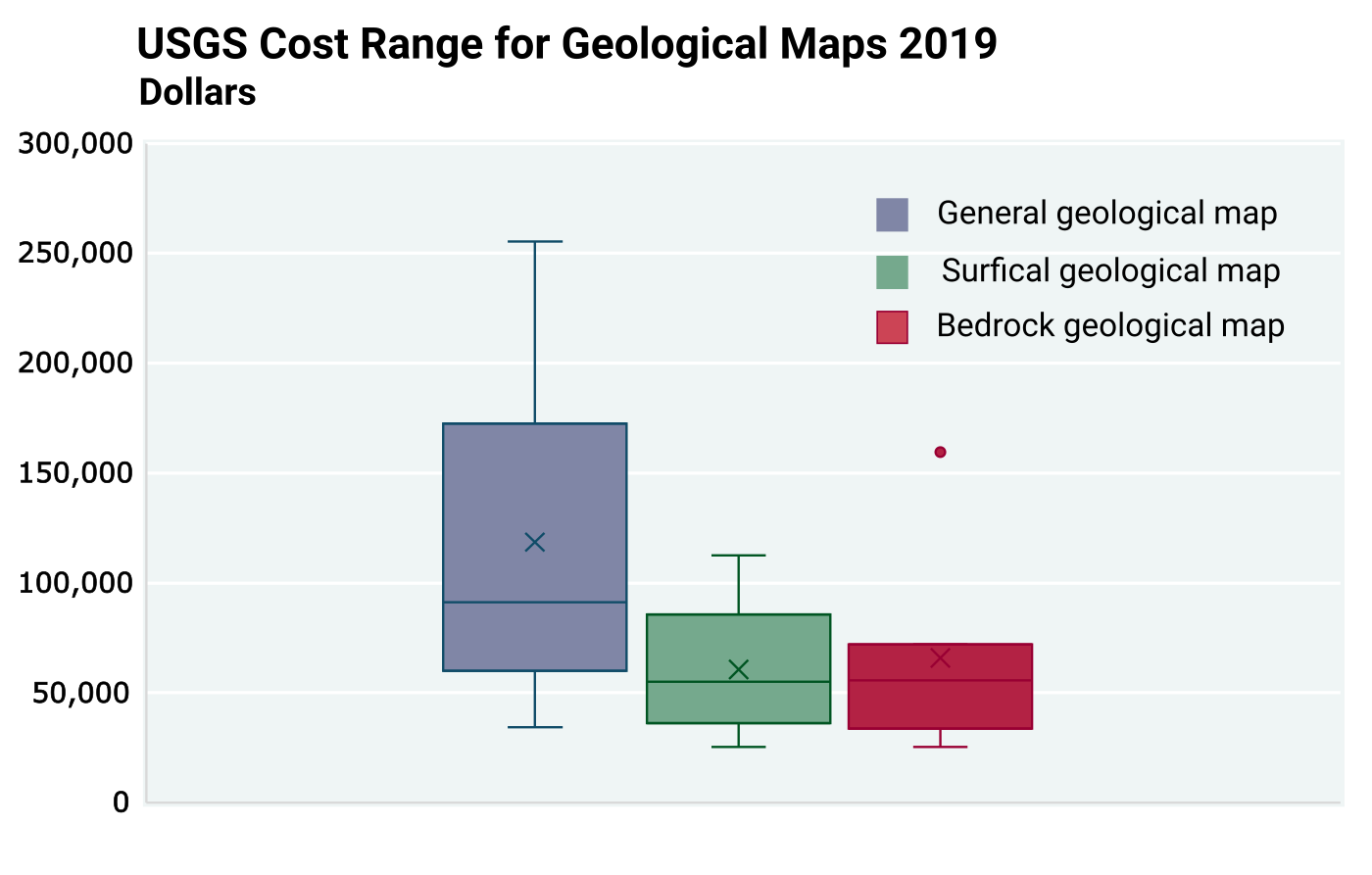
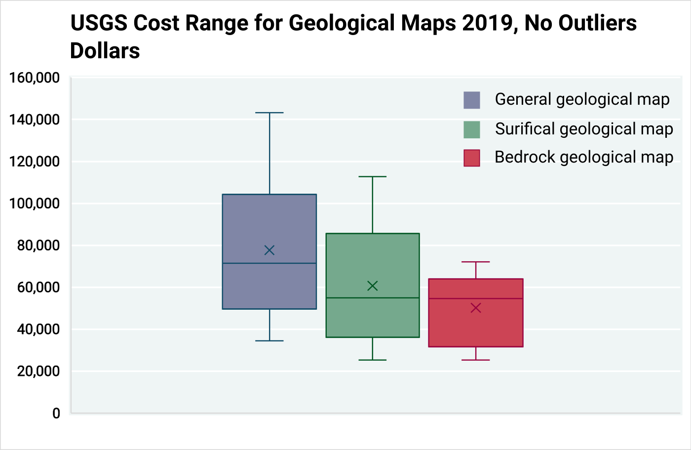
The NCGMP of the USGS was contacted directly to examine their 2019 costs for all SGS that received USGS funding for large-scale geological mapping (Shelton, personal communication, 2024). Although the USGS data are not state-specific, the total costs associated with individual maps can still be compared to the overall cost range in this report, since the funding comes from a combination of their STATEMAP program and the matching SGS funds. We can also compare these USGS map costs to the above ISGS map costs. A total of 158, 7.5-minute quadrangle (1:24,000 scale) geological maps were constructed in 2019 (Shelton, personal communication, 2024). A few maps also were created at smaller scales (e.g., 1:100,000), but these were minimal and have negligible impact on the summary statistics. Therefore, they were excluded from this comparison for consistency. The USGS provided the total costs for each of the map types (Table 8.5.3). The average cost for the 158 geological maps at 1:24k scale in 2019 was $53,495 for bedrock maps and $56,153 for surficial maps.
Table 8.5.3
2019 USGS Geological Mapping Cost Summary. The summary statistics consist of 158, 7.5-min quadrangle geological maps at 1:24K scale (Shelton, personal communication, 2024). All cost data were inflation adjusted to 2020.
National Cooperative Geologic Mapping Program
| Map Type | Average Cost | Median Cost | Minimum Cost | Maximum Cost |
| General | $77,345.46 | $65,455.84 | $34,418.12 | $255,510.00 |
| Bedrock | $53,494.65 | $55,791.41 | $25,325.04 | $159,466.22 |
| Surficial | $56,152.93 | $53,759.91 | $25,325.04 | $112,678.34 |
To further validate the high end of the cost range, two additional box and whisker plots were created using only the inflation-adjusted USGS data for 7.5-minute quadrangle maps at 1:24,000 scale (Figures 8.5.1 – 8.5.2). Figure 8.5.1 includes the mapping cost outliers, while Figure 8.5.2 excludes them. The statistical data on mapping costs provided by the USGS aligns with the average map-cost range derived from both the ISGS map cost data and the regional historical map-cost analysis reported in this chapter. This consistency suggests a common trend across the range of map costs and suggests a relatively high level of certainty in these findings.
8.6: Conclusions
The data acquired for this national study consists of two closely related datasets, specifically the questionnaire data (Appendix 2) that primarily addresses the assessment of benefits of geological maps linked to stakeholders and the spreadsheets that address state and federal cost data by SGS and the USGS (Appendix 1) for producing geological maps.
The NCGMP of the USGS was contacted directly to examine their 2019 mapping costs. Although the USGS data are not state-specific, the total costs associated with individual maps can still be compared to the overall cost range in this report, since the funding comes from a combination of their STATEMAP program and the matching SGS funds. We can also compare these USGS map costs to the ISGS map costs. A total of 158, 7.5-minute quadrangle geological maps were constructed in 2019 at a scale of 1:24,000. The average cost of producing bedrock maps at this scale was $53,495 compared to $56,153 for surficial maps.
Two key questions were discussed in the overview of this chapter (1) How many geological maps were constructed per year per region; and (2) What is the average cost of a geological map, based on regional data. Question 1 can only be applied to the state costs dataset, which is discussed in section 8.4. Question 2, on the other hand, can be intermingled between the results of both the questionnaire and cost spreadsheets; it is a question that is addressed through several approaches discussed in this report. The goal is to categorize and give a U.S. dollar value to the cost and quantify the benefits of a geological map. Chapters 3 through 7, 9, and 10 include empirical analyses and assessments of the questionnaire and cost datasets, U.S. EPA data, and values estimated by respondents. This chapter incorporates analyses of both datasets, including the stakeholder responses and SGS spreadsheets of state expenditures for geological mapping.
8.7: References
Beaver, Scott. Cost-Benefit Analysis Defined—The Ultimate Guide: www.netsuite.com/portal/resource/articles/accounting/cost-benefit-analysis.shtml (accessed July 2023).
U.S. Bureau of Labor Statistics, Division of Consumer Prices and Price Indexes, 2024, Consumer Price Index; https://www.bls.gov/cpi/ (accessed January 2024).
United States Congress, Office of Management and Budget, 2002, Guidelines and Discount Rates for Benefit-Cost Analysis of Federal Programs, Transmittal Memo No.64 ed., CIRCULAR A-94. https://www.whitehouse.gov/wp-content/uploads/legacy_drupal_files/omb/circulars/A94/a094.pdf (accessed 2023).
USGS Geological Survey, 2023, USGS National Geologic Map Database (NGMDB): https://ngmdb.usgs.gov/ (accessed June-July 2023).
USGS Geological Survey, 2023, USGS National Geologic Map Database MapView (NGMDB MapView): https://ngmdb.usgs.gov/mapview/ (accessed June-December 2023).
Table of Contents
- Abstract
- Acknowledgements
- Executive Summary
- Chapter 1: Introduction
- Chapter 2: Study Objectives and Methodology
- Chapter 3: Stakeholder Assessment of Map Producing Agencies
- Chapter 4: Cost for Geological Mapping
- Chapter 5: Geological Mapping Program Activities — Critical Components
- Chapter 6: Benefits of Geological Mapping: Quantitative Assessment of Responses to Stakeholder Questionnaire
- Chapter 7: Geological Map Demand and Economic Estimates of Costs and Benefits
- Chapter 8: Regional Variations in Costs and Benefits of Geological Mapping
- Chapter 9: Quantitative Value Assessment from Independent EPA Data
- Chapter 10: Qualitative Assessment of Value of Geological Maps by Stakeholders
- Chapter 11: An Economic Model of General Geological Mapping Applications
- Chapter 12: Stakeholder Input about Future Geological Mapping
- Chapter 13: Lessons Learned and Suggestions for Future Analyses
- Chapter 14: Summary and Conclusions
- Appendix 1: Cost Sheet Template
- Appendix 2: Questionnaire to Stakeholders
- Appendix 3: Example Solication Letter Requesting Stakeholders to Participate in National Cost-Benefit Assessment
- Appendix 4: Summary Statistics, Outliers, and Confidence Intervals
- Appendix 5: Annual State Geological Survey Map Views
- Appendix 6: Regional Cost-Benefit Analysis Datasets
- Appendix 6a: Questionnaire Data Schema
- Appendix 6b: State Geological Survey Reporting Schema
- Appendix 7: Chapter 8 Supplemental Figures and Tables
